| |

Neutral
|
*Rubs hands together manicly* I've got you. So, herein lies the reason I prefer the beta models: It's easier to determine direction and angle. BEcause I pretty much use the V1 models exclusively, some of my advice might not be of much help. But, what I do is trace over the original pose image, absolutely everything, in a bright color that's easily distinguished from the models. The outline, every joint (Except the fingers), every change in elevation. That gives you a good idea of how the model is shaped beyond just shading. It's basically wireframeing but fast and dirty. After the image is all traced over, hide the layer it's on. Don't delete it or move it, because you might have missed a detail in your tracing or accidentally erased a piece you can fix without the guide. Now, over the tracing, switch to your typical black pen/pencil tool, whatever it's called, and draw out the important figure details. That's basically just an outline of all the limbs. With that done, smooth out that black lineart. Make the elbows & knees look like actual human joints rather than balls. I reccomend putting your own arm/leg/whatever in a similar position to see how that pose would look in real life. Or grab someone else to play manniquin for you. Either way, you'll be able to see how skin, bone, and muscle look without needing to grab five other people to hold one pose for an hour while you sketch like the painters of ye olden days did. Anyway, with all the joints made to look like the actual thing, then it's mostly clean-up. Erase sections of lines that wouldn't be visible on humans, that kind of thing. Then, ta da, you have a basic lineart sketch of a human! From there, you can add the fabric effects and patterns, but I reccomend beginning with the basic figure before trying to add in all the details. |
|
|
| |
Neutral
|
Nice, nice- But since I use a different app to draw, that's also on what I'm using to use the JustSketchMe, how should I go about tracing?
Canis Inanis said:
*Rubs hands together manicly* I've got you. So, herein lies the reason I prefer the beta models: It's easier to determine direction and angle. BEcause I pretty much use the V1 models exclusively, some of my advice might not be of much help. But, what I do is trace over the original pose image, absolutely everything, in a bright color that's easily distinguished from the models. The outline, every joint (Except the fingers), every change in elevation. That gives you a good idea of how the model is shaped beyond just shading. It's basically wireframeing but fast and dirty. After the image is all traced over, hide the layer it's on. Don't delete it or move it, because you might have missed a detail in your tracing or accidentally erased a piece you can fix without the guide. Now, over the tracing, switch to your typical black pen/pencil tool, whatever it's called, and draw out the important figure details. That's basically just an outline of all the limbs. With that done, smooth out that black lineart. Make the elbows & knees look like actual human joints rather than balls. I reccomend putting your own arm/leg/whatever in a similar position to see how that pose would look in real life. Or grab someone else to play manniquin for you. Either way, you'll be able to see how skin, bone, and muscle look without needing to grab five other people to hold one pose for an hour while you sketch like the painters of ye olden days did. Anyway, with all the joints made to look like the actual thing, then it's mostly clean-up. Erase sections of lines that wouldn't be visible on humans, that kind of thing. Then, ta da, you have a basic lineart sketch of a human! From there, you can add the fabric effects and patterns, but I reccomend beginning with the basic figure before trying to add in all the details.
|
|
|
| |

Neutral
|
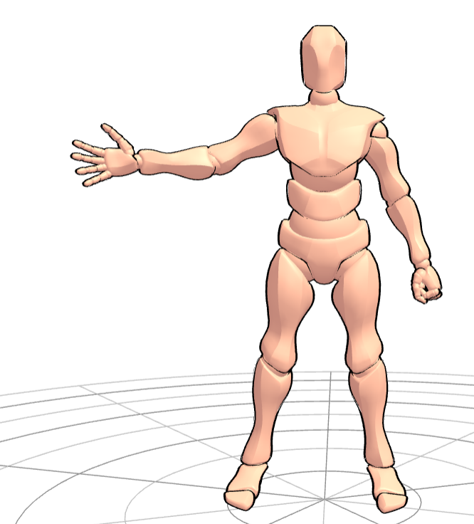
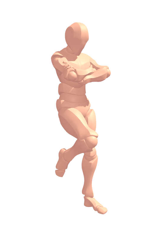
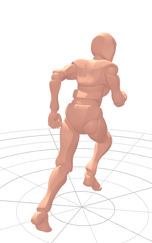
Alright, here's a more visual example & explanation of why I use the V1 models. You can see from the way each limb section is built how the muscles are supposed to lay, in extrema at least. The harder angles allow for an easier time differentiating between joints and elevation levels rather than a smooth curve. The thicker areas show where more muscles would lay and provide a base for more stylistic limb shaping. Because all the joint indicators are rounded and the limbs are blocky, it's considerably easier to tell between, for example, the elbow joint and forearm. Here's a more recent model I made, still a static pose, but without the outline: You can tell what everything's supposted to be, and how it's positioned, plus very basic shading. While the more realistic models show more minute details, like the eye sockets & nose tip, it can get very hard to actually draw those when the image is on the smaller scale. Alright, here's my final example, a flash freeze of a runner: Personally, I just find it easier to use the bare bones models because it forces me to actually alter the base outline in order to look realistic, beyond slapping a face and clothes patterns on it. But that's just me, and I will readily admit that I am indeed weird, so feel free to make your own choices. ~ Okay, rant over, on to your actual question. Since I have no idea what you're using or how it works, I'm going to throw some ideas on the page and hope one of them matches up to a function. Most drawing apps should have some kind of 'Import Image File' option somewhere. It might have a different name, but there's usually something that will allow you to draw over an image you have downloaded. And if your app doesn't have access to a basic layer function {Excuse my haughty artist's sensibilities, but it be a bootleg program}, you'll just have to make due with tracing over tracing over tracing, then save the final mess of lines to work on coloring it. If it does indeed have layers, make fifty thousand. A layer for every. Single. Individual. Color. One for the SketchMe pose image, one for the first carbon-copy trace, another for the final lineart, a differnt one for detailwork you might have to erase until you finish it to then trace back onto the lineart layer, one for every section you plan to color (Like, the 'skin' layer', the 'shirt' layer, etc.), do not forget the background layer even if it's just a solid field of off-white. Layers for everything. It sounds like an obscene amount of work right now, but you will thank me later when you want to change the color of the jeans and don't have to worry about accidentally erasing part of the shoes. Yes, I take drawing way too seriously. Surprisingly, I am not an art major. |
|
|
| |

Neutral
|
Trust me, the layer thing is understandable- I had three layers on literally a building, three stick figures, and background. sooo, yeah. |
|
|
| |

Neutral
|
If you couldn't tell, layers are my favorite part of any digital art program. At first, I thought I'd never really get into digital drawing, but then I found out the original program I'd been using was total trash and literally anything would be better. |
|
|
| |

Neutral
|
Same though, layers make everything so much easier.
Canis Inanis said:
If you couldn't tell, layers are my favorite part of any digital art program. At first, I thought I'd never really get into digital drawing, but then I found out the original program I'd been using was total trash and literally anything would be better.
|
|
|
| |

Neutral
|
I now have the imported image- Hahaha. And now I just trace and trace, right? |
|
|
| |

Neutral
|
Yep. Trace until you've got a final lineart you really like, hide all the other ones, then start coloring. |
|
|
| |

Neutral
|
Alrighty- This is now what I have so far lmao - |
|
|
| |

Neutral
|
That drawing is quite literally leagues ahead of the previous iteration. Good job! |
|
|


