| |

Neutral
|
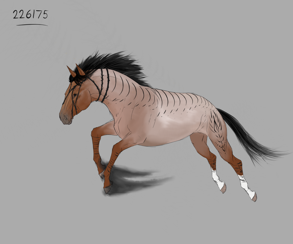
Heyo! I'm not really sure why you'd want art help from me aha, but, I'll plop this thread here anyway. I still have a looong way to go in my artistic journey, especially in my anatomy work. Either way, maybe I can be of some help to you guys? I can comment, redline, etc. I'm best with equine anatomy, I think? I also have experience with canines as well! Em, yea - that's all I gotta say!
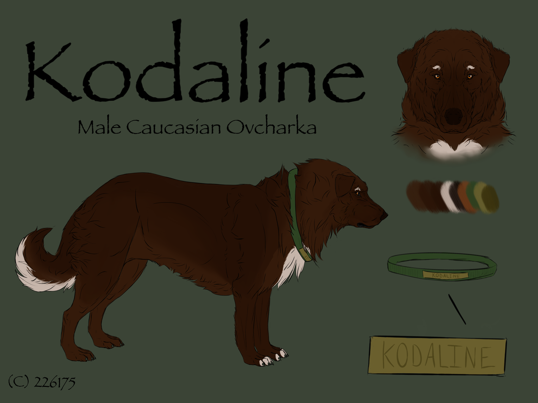
--- exp. (all art credits to me)  Floofy boyo belongs to Grimm ^^ .  ~Shadow Hunters~ lovely OC! -- It makes me really happy to help people, and I'd love to see any redrawn/improved pieces! Questions are always welcome! . Some stuff to note: If you post here, I will dive into a full on analytical sort of critique. By no means am I doing this to offend you - I mean my comments to be completely constructive!
Secondly, please specify what sort of help you'd like! A few sentences? Redline? Whole few paragraphs of writing? Specific parts for me to look at? It helps me manage my time better, as paragraphs of critiques take a very long time. Please know that when you ask! . So,
Without further ado, please feel free to post! |
|
|
| |
Lightbringer
|
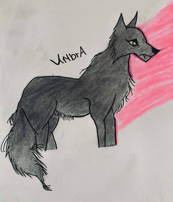
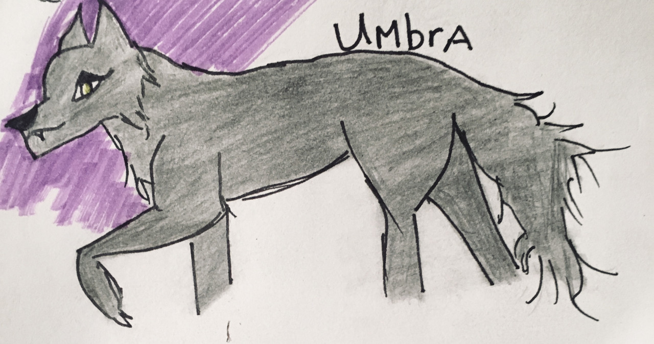
Hey Starry I need help with wolf/canine anatomy ^^' Ill be back for help with equine anatomy later (c) Me 

|
|
|
| |

Neutral
|
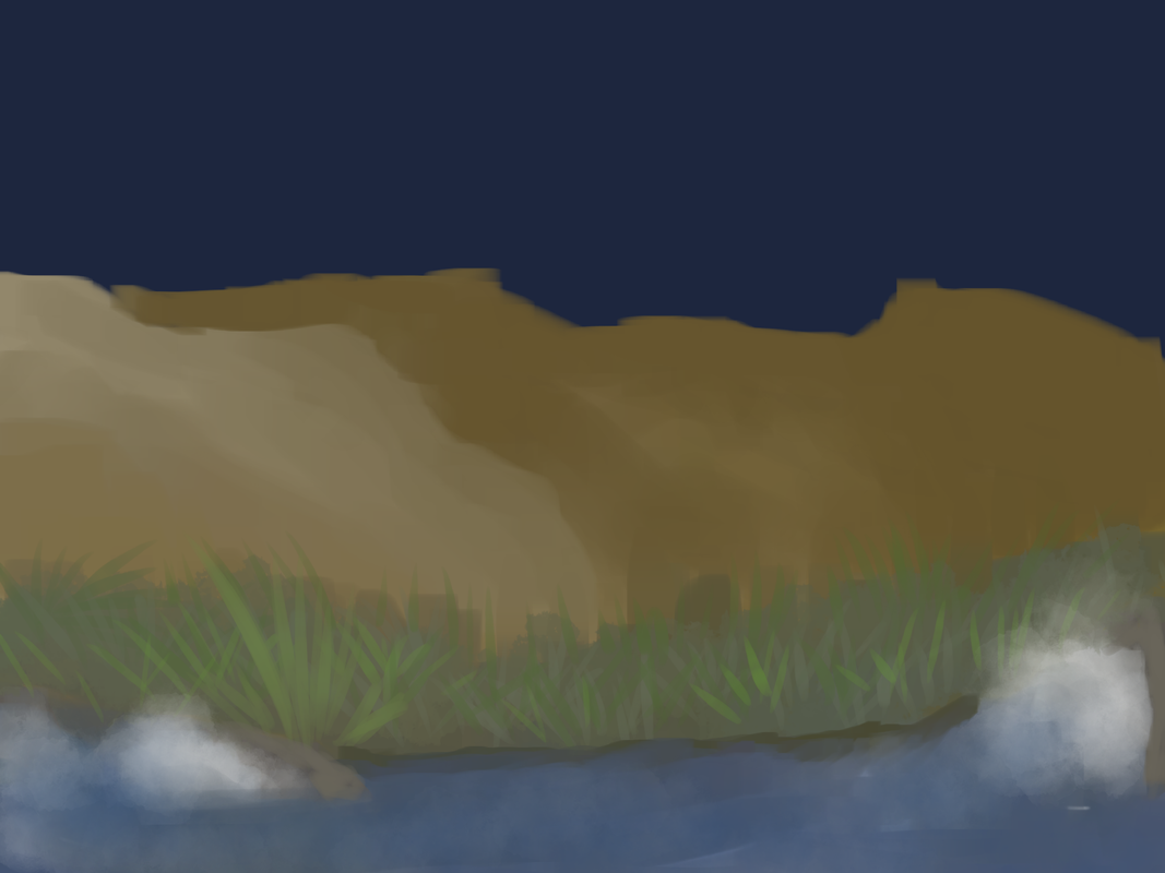
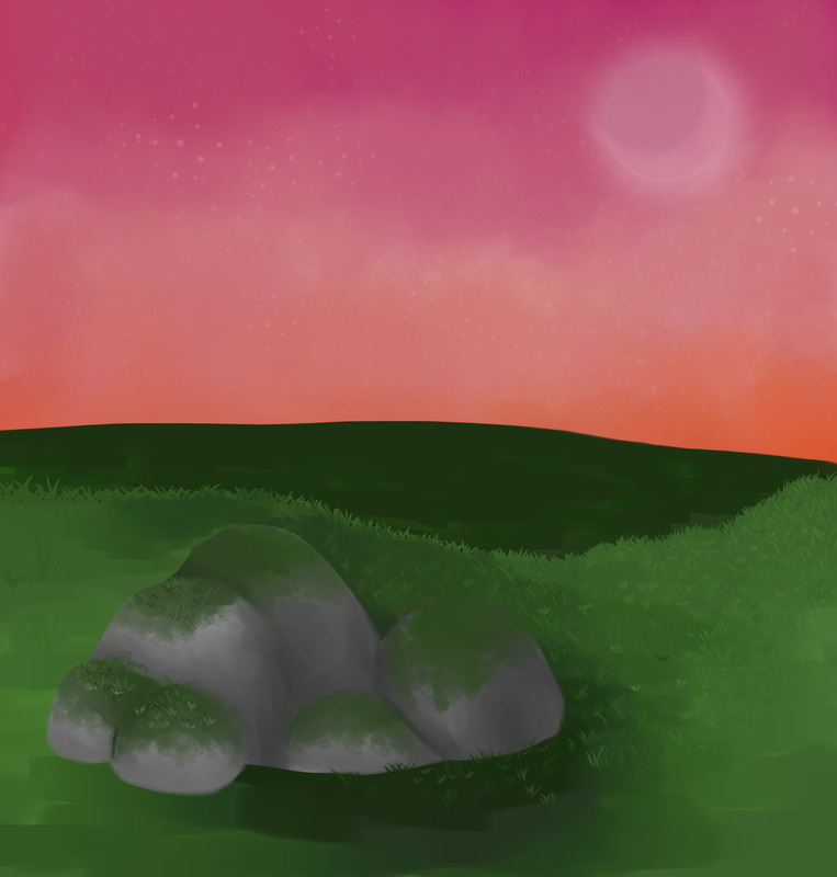
Heyo! Could you offer some insight on backgrounds? It's a bit of an old piece I gave up on but oh well Newer: (Both pieces by me ^^) |
|
|
| |

Neutral
|
Spell I'd be happy to help! I think that you have done a wonderful job on both pieces. Would you prefer a redline or a long blurb of writing? . . . Bear Oh, those look lovely! I do have some points to make, though :) . For your first piece, I think you've done a great job with the water! The splash is a nice touch. My only edit for that is to try some more streaky shading to convey the water's movement. I do think, however, that you could try to either fade the dirt of the land into the water, assuming the river is shallow, or if the river is deep, add a ridge on the river bank for realism. An undercut river bank, I believe the technical term is? You can look that up and find pictures of what I mean! A strong river would have carved a path through the land, leaving a little channel cut out from the earth. The land would have to be higher than the river. As a result, you would have to move the grass upwards above the newly created rise in the land. My second point is in regards to the mountains in the back. Or hills. Either or. Whatever brush you used for the shading looks great! On that note, maybe attempt using some loose mountain/hill references to add some more highlights and shadows. It'll add depth, and look much better in the long run! My main issue with this is the distance. To me, the hills appear as though they are a simple large rise of sand right on the river side. If you're going for distance, I suggest letting the grass extend back a little further, and fading the green into the brown of the hills/mountains. Last point! For the sky, which I assume is of the night, try some stars! If it's cloudly, give the faint outlines of clouds a go. You might want to draw out some of that blue if you aren't going to add in some star or moonlight. The night is actually very black without. All aside, I find the color combination very pleasing to the eye, and I believe this piece has great potential! Well done. . . On to the second piece! I absolutely adore the color choice and overall aesthetic of this piece. Absolutely gorgeous. I especially adore the sky - the faint haze of clouds, the dappled stars, and the outline of the moon is stunning. In all honesty, I don't have any edits on that! I think you have done a nice job on the grass. The little sprigs/blades work well with your piece. I would suggest extending the range of grass over to the left side of the canvas as well, for the sake of balance. For the second hill, the value change is lovely. However, I would try to smooth out the shading a bit. Maybe try to lighten the coloring of the second hill on top, then gradually fade into the dark green as it meets your first hill. So, the rocks: the shading is very well done, as is the moss. While shaded will, they appear rather flat, as though they were cut from one picture and pasted into yours. (I'm of course not accusing you of theft, I know you drew them aha). On the outsides of the boulders, darken the shading of the rock, then lighten it inwards. You sort of did this on your right-most rock. Secondly, add some grass around the bottom of your boulders, so they aren't just hovering over the ground! I suggest having an entire layer of grass completely covering where the boulder transitions into the ground. If you'd like to avoid the look of a cropped drawing, darken the shading on the bottoms of the boulders, then lighten higher up. Your boulders shouldn't have flat bottoms, so try to avoid any sharp edges and flat bottoms. Round them a bit. You have done this for all your boulders except for the lowest middle one, and largest left one. Lastly, for the most realistic effect, toss some smaller boulders and pebbles in your scene as well! It'll really tie the whole thing together. Overall, I'm very impressed with your work! I'd love to see any edited/final images if you decided to rework these. Well done! |
|
|
| |

Lightbringer
|
Starry could I get both please <3 |
|
|
| |

Neutral
|
Of course! Gimme a quick sec to grab my ipad from whatever corner it's hiding in. |
|
|
| |
Darkseeker
|
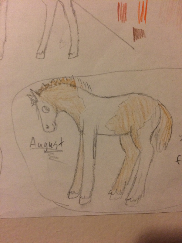
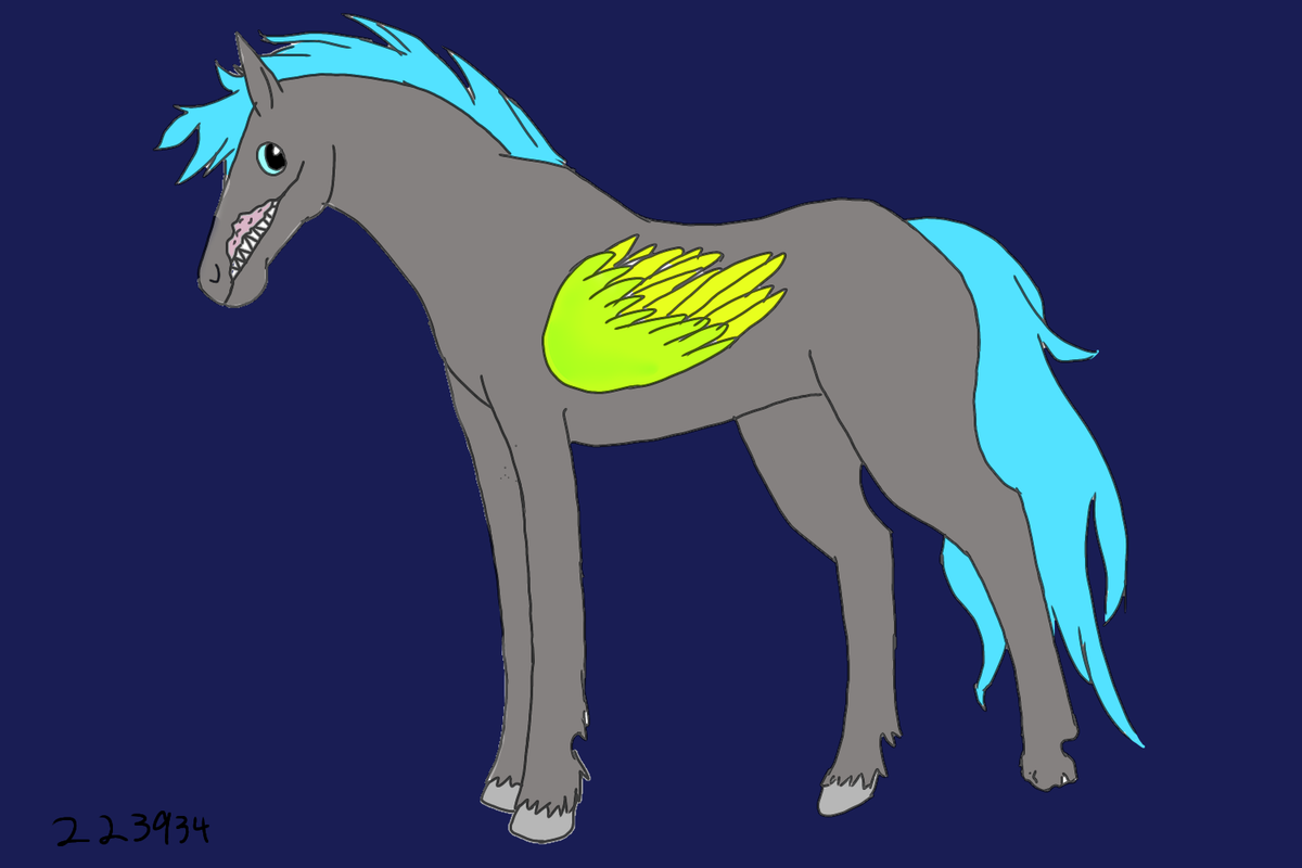
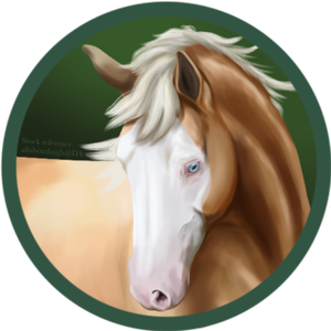
Help me with horses!!! (all art by me) His wing is supposed to be small, it’s stunted. |
|
|
| |

Neutral
|
I'll start redlining + writing once my ipad revives itself! |
|
|
| |

Neutral
|
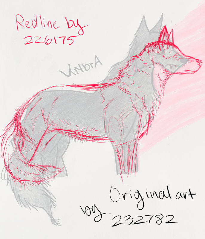
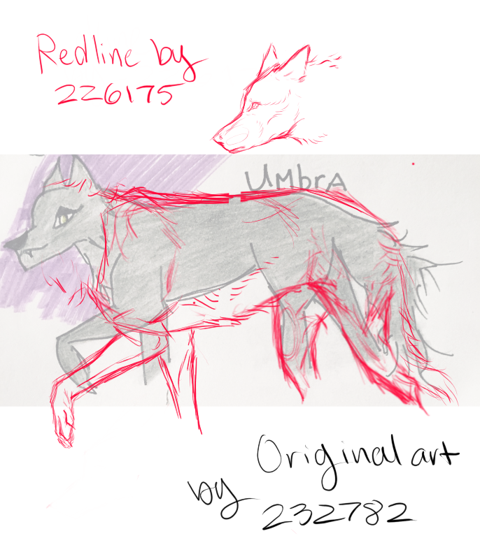
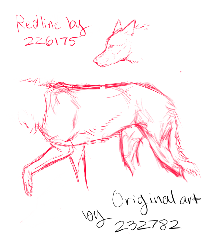
Spell . Piece one, redline:   I must say, the redline was a bit of a challenge for me! My style greatly differs from yours aha which threw me off. Anyway, I tried! I'll start from the back and work my way forward. First off, the tail. I'm very impressed, actually - your tail doesn't look flat in the least, which is what most people's mistake is, so well done! The hip and hindquarters also look great, with a nicely done slope. The thigh, however, should be sloped backwards, and angled back. Wolves don't have straight thighs, which is a common mistake for many.
On to the back. You can slope it downwards, but you have to make sure it slopes back upwards. The shoulders should be even with the hindquarters. Continuing with the shoulders, it is important to make sure they are defined and even. From there, the neck starts at or a little below the shoulders. A wolf's neck is actually pretty even - think fluffy parallel lines, the bottom of which drawing slightly inwards near the head, before extending outwards again to meet the head. For starters, your ears look good. In regards to the head, the skull is not quite so round. You draw your muzzles very differently from me, but I love the look of yours! Make sure the eye is placed farther up and forwards on the head. That's it! I really enjoyed your style ^^ You combine sharp lines with soft, while maintaining consistency throughout, and it looks stunning! Lovely work. |
|
|
| |

Neutral
|
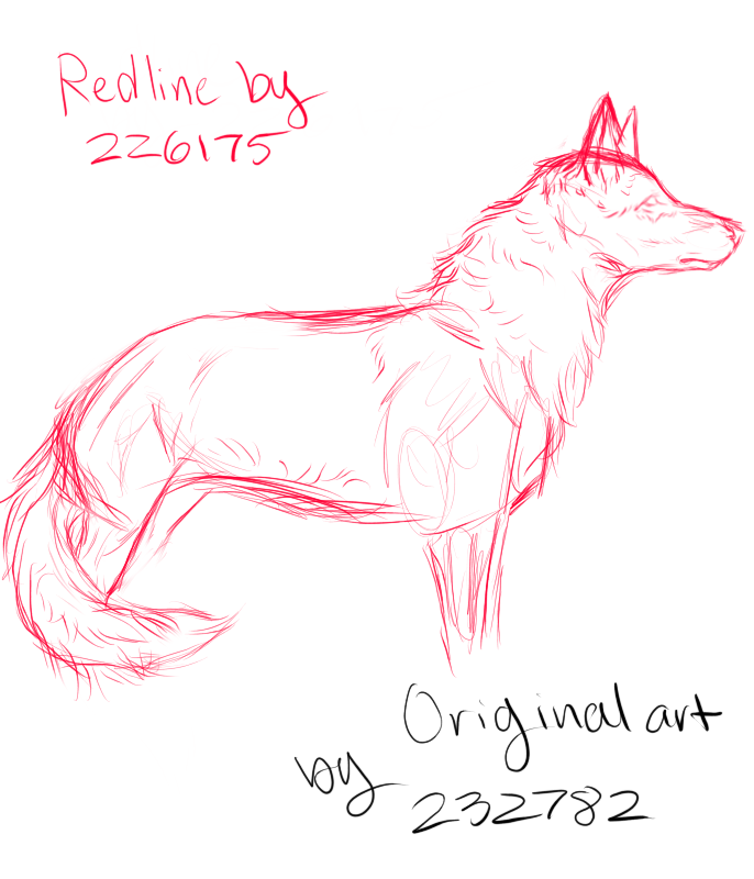
Spell . Piece two .   In terms of anatomy, I think you've done a wonderful job! All my points are very minor. Wolves are very floofy and not quite so skinny, so I dropped her stomach a bit. You did a lovely job with her back and hindquarters! The neck shoulder joint looks much improved from your first piece. However, her neck is a little too short. For this reason, I couldn't fit her head in the frame when redlining. Whether you meant to or not, you have some good perspective on the head! It's not a flat side view, like the redline aha. I'm impressed, because most can't pull that off well, myself included. Same as before, her head is a bit too round. Her chin should be drawn back a bit, and I might make her ears a bit bigger, but other than that, looks perfect! So, the legs: same point as befor with the hind legs - they aren't going to be vertical. There is some slope. Because I dropped the stomach, I had to lengthen her body, so that's why the redline has a longer frame. Her forelegs look good! My comment is to not narrow her leg too much at the paw leg joint. You did well with the paws, though, which is more than I can say for myself aha Final point: the tail. Again, well done with avoiding flatness. However, her tail does not extend outwards before falling down, so make sure to keep her tail at her body! Overall, I think the second piece is really well don! Plus, the perspective on the head is lovely. Again, great work!! |
|
|
