| |
Neutral
|
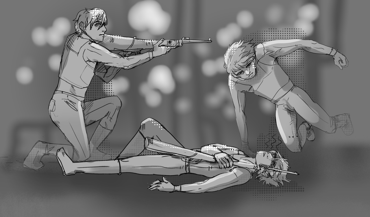
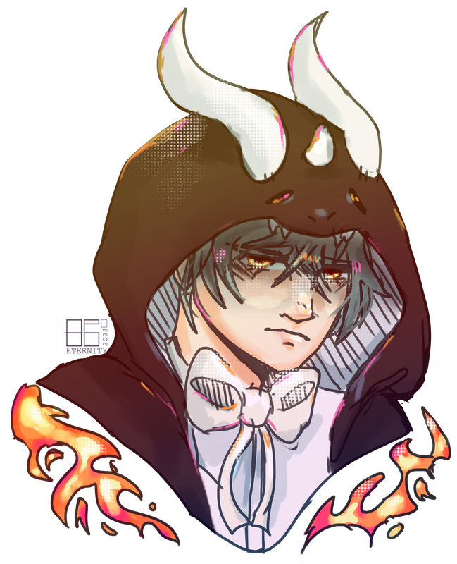
I dropped off the face of WP for a while while I went on vacation but I'm BACK BAYBEE To below: YAYUS I love me some paragraphs of epic proportion, lol, someone needs to stop me. Oh dang two images a day? So full illustrations? Hot dang I don't think I could do an image every other day as you say you're doing now, that's still a rapidfire rate of art production yo! :O And yes! I will never not enjoy your wips. I love seeing the process, so much.<3 Yeeeeee and oh hec yes to that classwork, look at it! So delicious. The movement, that leap from the character on the right, like they could hop right out of the page is crazy. Gimme them proportions while you're at it please, I eat proportions for breakfast :3 And color for lunch cause dang if that oc for Lost_Griffins ain't fine! >:0 The placement and use of the halftone is immaculate.
Eternity said:
BACK AT IT AGAIN WITH THE PARAGRAPHS OF EPIC STUFF, GOD. You're very right about that! :0 It's hard to live up to knowing I used to be at an average of 2 images a day and now it's about 0.5 of one D: but you're very right, so thank you <33 it's much appreciated. I do really like sharing process shots and WIPs so I'm really glad you enjoy them! :D And thanks again aa <33 here's some more classwork, albeit messy because it's due in 6 days LMAO  Beloved banana gun as I don't have time to make it neat <3 DON'T HAVE TIME TO MAKE IT NEAT BUT I'VE GOT TIME TO DRAW FOR OTHER PEOPLE LMAOO ;>>> Anyway, here's this piece of Spoons for Lost_Griffins in the Draw The OC Above You game  [Both [c]157083]
"I shotgun coffee like beer" has a ton of energy, it's absolutely explosive with it! I can't wait how you translate that into the render. :0 Oooh Hellish! The improvement between the two pieces showcases what you've accumulated in artistic knowledge between them beautifully. "IT WILL COME BACK" is absolutely horrifying and I love it. Your skkettchskdjses- sketches, haha, are so dang nice, look at them forms! You've captured the way they're interacting well. They're physically in their space and having a casual conversation--it's like you can almost hear their voices. Oh they're definitely having a debate over which has superiority between Lucky Charms and Cocoa Puffs, in the refined sketch. Ooooh Folke! The skylization is confident, the lighting is on point, and the piece as a whole is gorgeous. :3 |
|
|
| |

Art Team
Darkseeker
|
I've been suuuper busy so about time to respond to all these LMAO.
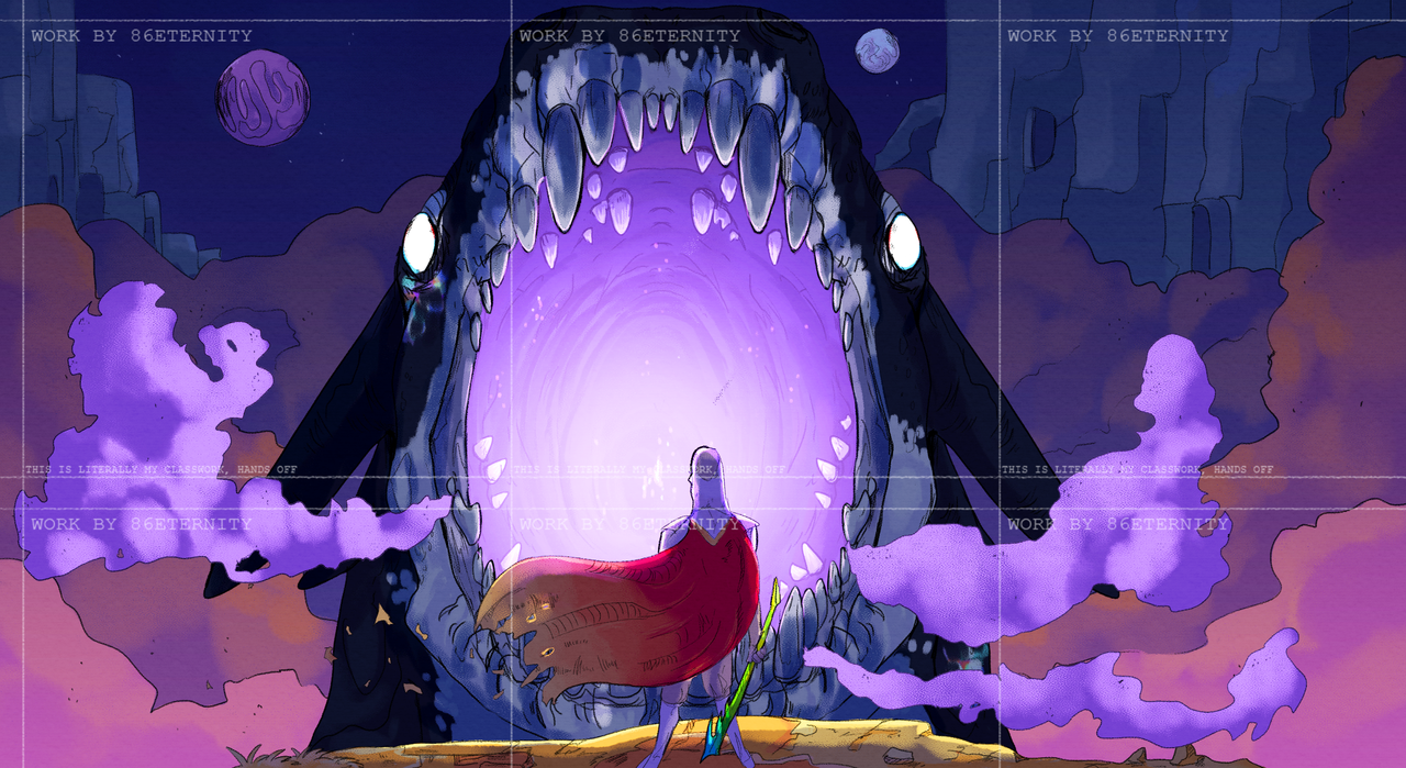
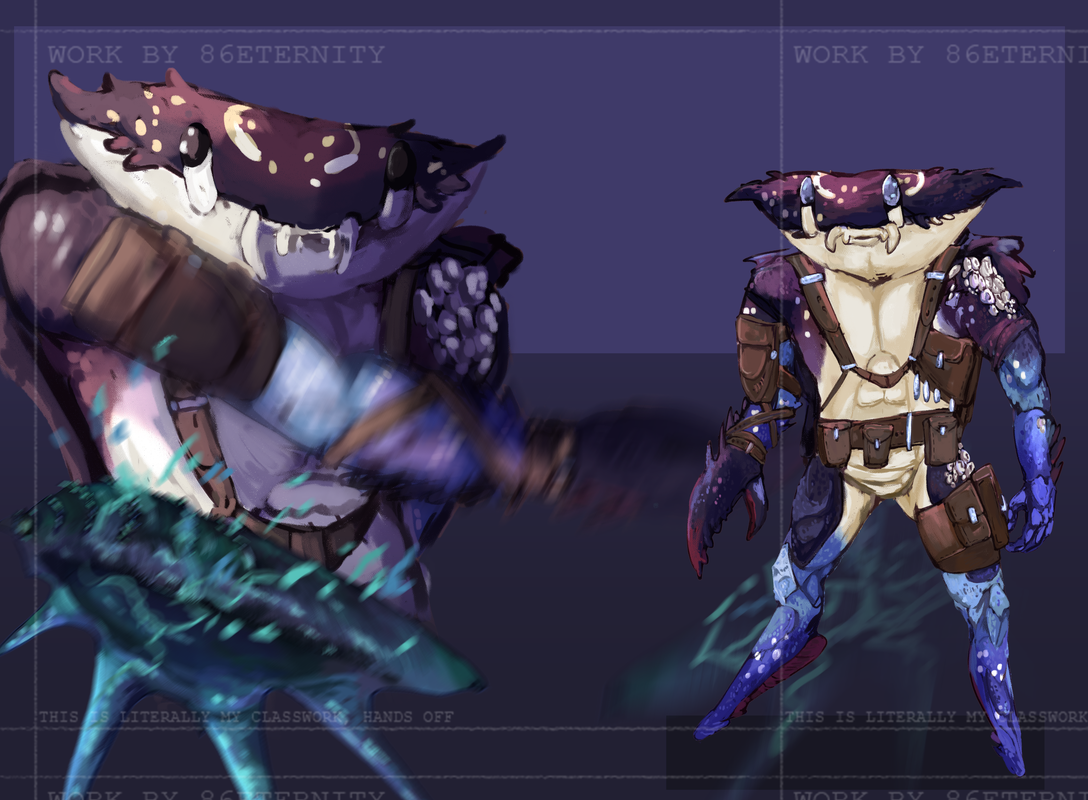
The West Wind Wolves Thank you so much! <33 I appreciate it! :0 Ecifircas Yes it does, always 👁️ And thank you <33 Drawing Folke is always a nice way to ease up after LITERAL HOURS UPON HOURS OF CLASSWORK. Yuketa HELLO I'VE MISSED YOU- Absolutely weeping at your kindness as usual omg. You've always got such nice things to say aaaa it's hugely appreciated <33 -- On the subject of classwork, I've finally got everything handed in. So uh,, here's some of the flashier pieces. In case anyone is wondering, I'm a first year concept art student at university ;> As always [c]157083   And some development work for the above pieces  |
|
|
| |

Neutral
|
|
| |

Neutral
|
BEAUTIFUL The lighting in the first one is just- AHHH And the blur and movement in the second please- - Just curious, how does your classwork work? like do they give you stuff to draw or do you draw whatever you want, if you get what I'm asking lmao |
|
|
| |

Art Team
Darkseeker
|
Hoalvinous
Thank you so much!! :D
Le Stalk
Aaa thank you! <33 I really appreciate it.
So it depends on the class. Each semester I actually have three different classes which cover different things! :0 These range from focusing on traditional art skills [like anatomy and perspective] or 3D software or more traditional concept art classes. There's a *huge* range in what I might be studying.
The work above is from two different classes and they're the later stage or 'finals'/'outcomes' of those classes.
The class that produced the top piece of artwork focused a lot on pre-modern artists. I spent a good few weeks redrawing old pieces of art, trying out different styles and methods and producing a final piece which is inspired by the works of artists like Moebius and Philippe Druillet. The task for the final piece was to create a piece fitting the theme of 'George and the Dragon', which is a myth from the UK :0 following Saint George.
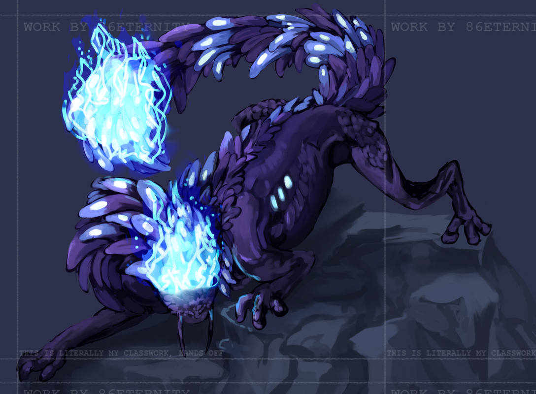
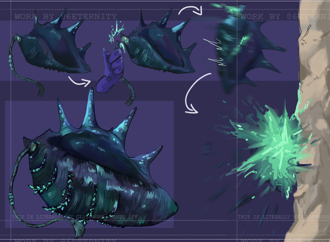
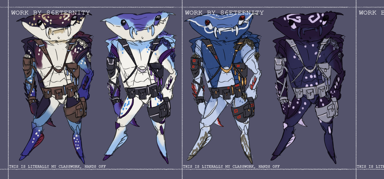
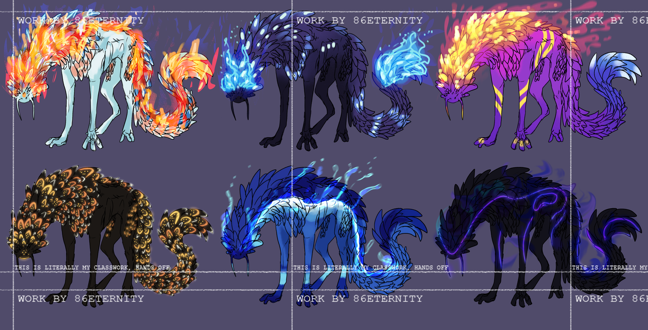
The pieces after that follow what you assumed more closely. At the start of the semester we were given the choice between two briefs - each brief was a different genre. The brief I picked required me to develop three things: A character capable of fighting a giant sea dragon, a companion for that character who would aid them and a prop for that character. Other than that and some guidance from my teachers I pretty much had free range!
but there's a lot of critique and development work, iterations, thumbnails,, all that kinda stuff that goes into developing the final piece.
Basically I get a project I need to complete for each class, but I just like posting the finals here because they're pretty lol.
SORRY that's a super long answer but I hope it makes sense! :0 |
|
|
| |

Neutral
|
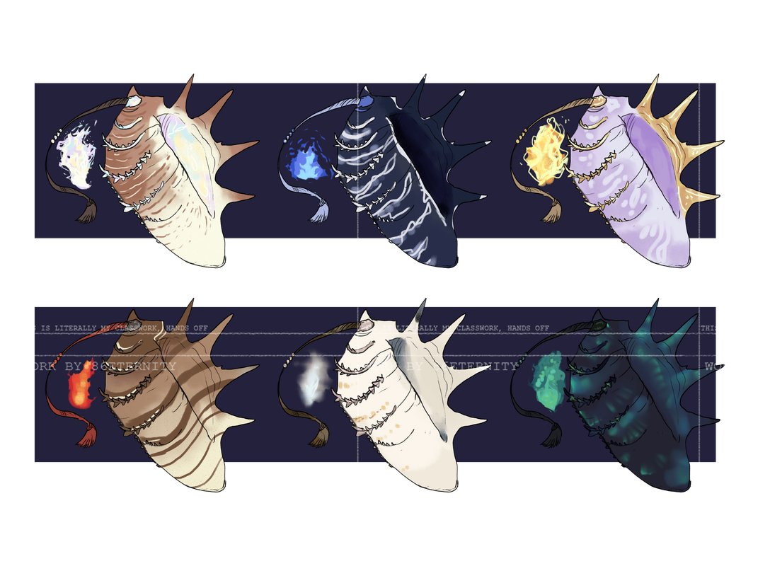
Eternity - AHDJJSG I'VE MISSED YOU TOO <3 <3 <3 <3 <3 And yES, always always always! I love seeing your work and letting you know how good it is by dropping in to remind you every four seconds sjfjhsd- but like, truly, you do deserve every kindness for the work you put into your craft. Over four years of dedication to this gallery and the classwork of freaking nuclear proportions are no joke. <3 :3 - So, speaking of classwork-- These fit the concept artist-vibe super well! You did mention that they're some of the flashier pieces, and I can see that in the intentional design work, as well as in the vividness and thoughtful use of color. Clearly you've been learning and applying a cacophony of art concepts and cohesively and effectively combining them in these classwork examples. - The piece regarding the theme of "George and the Dragon" is strengthened by that use of lilac and lavender. It demands attention and takes up the center of the canvas, literally center stage. Like that cave-dragon-esque figure ready to snap down, it's almost trying to consume you, your focus. Steal it away, and lure your gaze to the fluttering red cape. There's good movement here. The quieter tones of the background objects and features help aid the contrast of importance, and draws you right back into the violent violet maw, and to the man. - Okay the crab people right--they're so stinking derpy and so good. I simultaneously want to give them a hug and also kind of want to try punching them in the eyes. (I'd probably be too short to do it, though, let's be honest hajfsn-) The color decisions on them and the conch grenades are done with such skill. The way different blue-purple tones are captured on their carapaces are perfectly the cat's pajamas. - I don't think I am capable of fully communicating how much I love how the slipperiest slinkiest bois turned out. The epitome of a combination of multiplicative iterations, masterful color work, pattern and texture integration, style variety, the elemental depictions. This is all I could ever want or ask for in the best dragon salamander squiggly whiskered doggos. I love them to the end of the world and back. But I can't lie, that first one does remind me of Bloom from Winx Club, hahaha. Still love em. - Fantastic work as always, Eternity! :D |
|
|
| |

Art Team
Darkseeker
|
Waaa thank you again and again and again Yuketa qwq
It is hugely hugely hugely appreciated and I really just cannot ever find the words to show that enough <333
Just know I read every single word every time and do so over and over again.
--
Onto a real mixed bag of posts! :0
Firstly, the results from my random giveaway over on TH <3
These were super fun to do and use old, unused sketches from 2022. Super fun to fix up the anatomy and see how much my art has changed!
These are for the users BrokenArchangel, RabidWinter, AyukioCC and Gardog over on TH. Annnd now some miscellaneous stuff.  |
|
|
| |

Neutral
|
Ouuuh I love the last one! Are they some OC's of yours? |
|
|
| |

Darkseeker
|
More Art For Me Ta Hug :O |
|
|
| |

Neutral
|
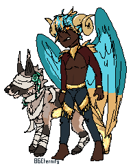
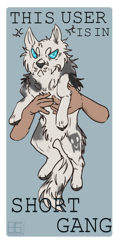
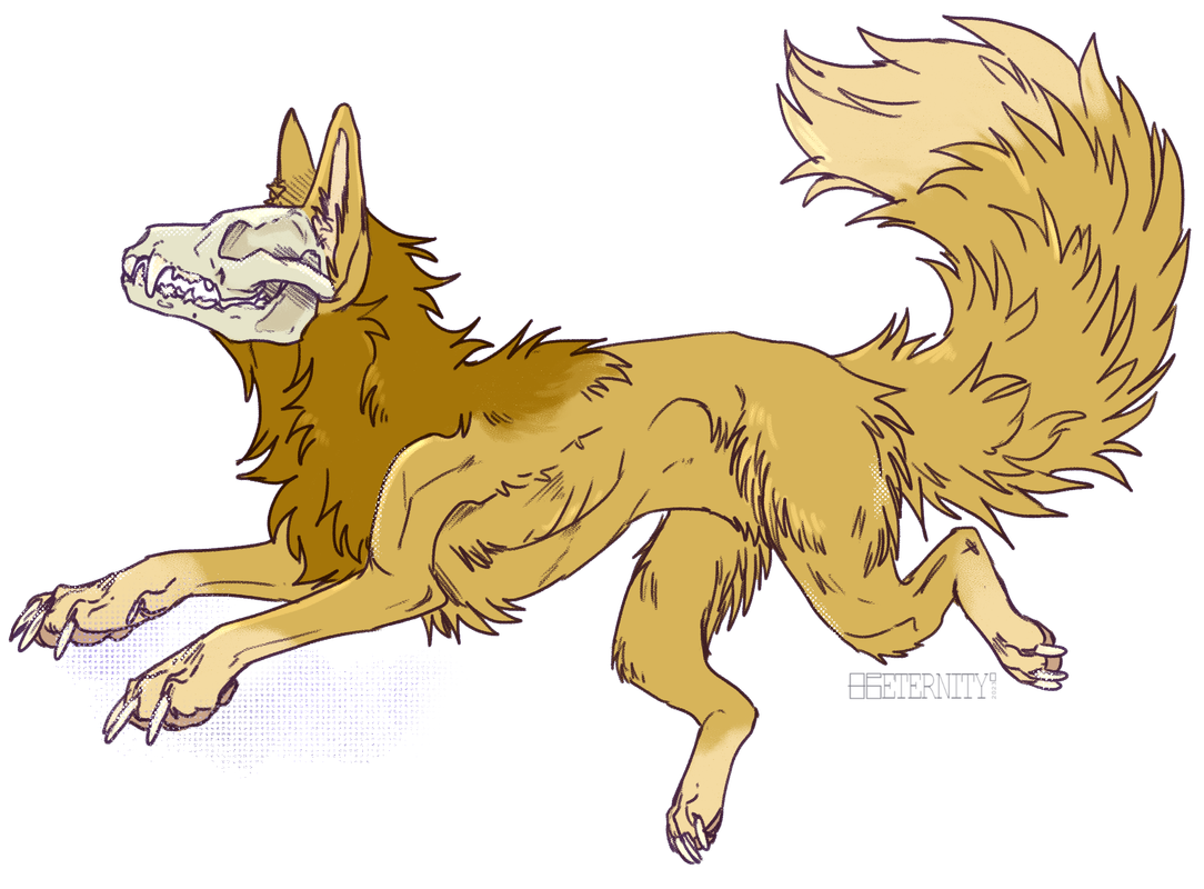
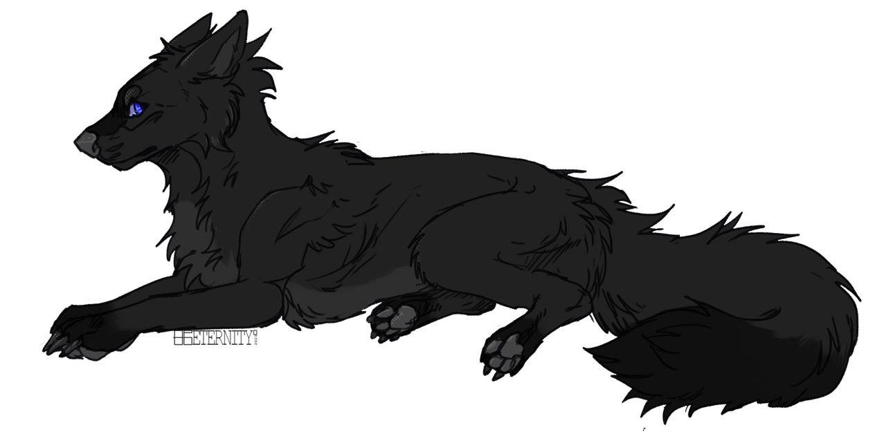
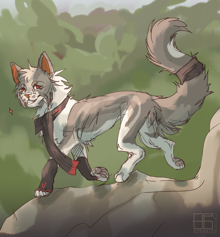
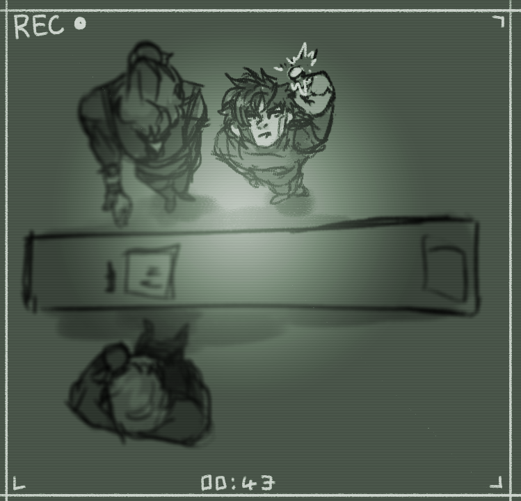
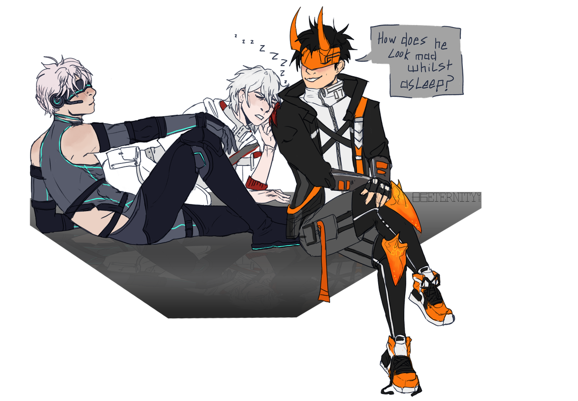
Yesssss my dude! :3 I appreciate your appreciation too, even if you can't find the words for it lol <3 Jajdhsjd I know now, and I understand! XD Know that you don't need to feel obligated to go through everything meticulously, I know I have a lot to say hahaha. - And oh hec a mixed bag! I love that you reused old sketches for these first ones, it's a creative idea and makes for less work (usually). The first pixellated one packs quite a bit of detail for being so small, and the angry pupper in the short gang image is so good and cute! XD The next two wolves have a very good form, and I like how the skull quietly sits over the neck of the first one. - The scarved cat is so soft, and has super nice, gentle lighting! They're absolutely frolicking! And the expression on their face with the sparkle beside it is immediately telling of their personality. - What the hec that vertical camera angle is so hard to pull off well, but you did it! The foreshortening is gorgeous! >:0 - The last one is so nice, just three characters interacting and sleeping on a ledge. They are definitely in the same space, which can be difficult to do for group illustrations when one might be too big or small, and another might appear to float, but these three (and other group drawings you've done) showcase how you've gotten these aspects of sharing a spacial plane down quite well! Great work. :3 |
|
|


