| |

Game Moderator
Darkseeker
|
Annd onto my next commission <3 All art on this post is [c]157083 Eternity [WPG] [DA] [TH]
My alternate online handle is 86Eternity
| Art on this thread may not be reused, reposted or repurposed. | | |
|  |
|
| |

Game Moderator
Darkseeker
|
Flats down! :D All art on this post is [c]157083 Eternity [WPG] [DA] [TH]
My alternate online handle is 86Eternity
| Art on this thread may not be reused, reposted or repurposed. | | |
|  |
|
| |
Neutral
|
Oooh, the lens blur tool? Might have to check it out :0 (Gaussian is my bff) - And I really appreciate seeing the background by itself! It's interesting to see if and when someone decides to add details that will be covered up later, or omit them as deemed unnecessary. ---- Alsoalso, hot fox man?? |
|
|
| |

Game Moderator
Darkseeker
|
Yuketa said:
Oooh, the lens blur tool? Might have to check it out :0 (Gaussian is my bff) - And I really appreciate seeing the background by itself! It's interesting to see if and when someone decides to add details that will be covered up later, or omit them as deemed unnecessary. ---- Alsoalso, hot fox man??
Yes! :0 Photoshop [the program I use] has many many different blur options! This article from Fire Alpaca shows the difference really well! [Image below from linked article] 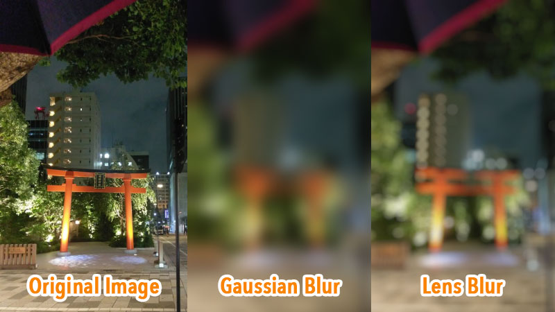 I usually use lens blur for quick backgrounds as it keeps some clarity in the image! I'm glad! I really like to show the process of my art pieces :D Yesyes, the fox man is now finished, this was a commission for AyukioCC <33 [thanks again for commissioning me Ayu!] 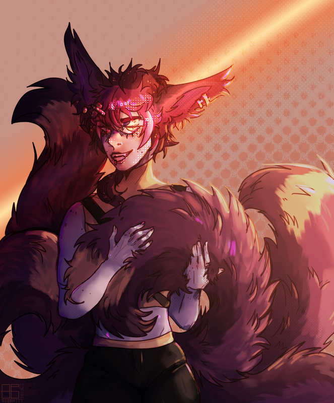 [c]157083 |
|  |
|
| |

Neutral
|
Eternity - Aaaaaahh! Nom nom nom, very good! Love the explanation too. <3 And dang, Photoshop! I've tried using it for art, but it feels different from my main, Krita. I think it's easier to edit photos or finished illustrations in it--if you don't mind, can I ask how you use it? XD - And* awe yesss he came out fantastic! The warmth in the image with the feeling of a sunset is palpable! |
|
|
| |

Game Moderator
Darkseeker
|
[all art on this post [c]157083]
Yuketa said:
Eternity - Aaaaaahh! Nom nom nom, very good! Love the explanation too. <3 And dang, Photoshop! I've tried using it for art, but it feels different from my main, Krita. I think it's easier to edit photos or finished illustrations in it--if you don't mind, can I ask how you use it? XD - And* awe yesss he came out fantastic! The warmth in the image with the feeling of a sunset is palpable!
It's very helpful! My favourite blur for real [I use it allll the time in quicker pieces ahah] Photoshop is certainly an interesting program! I've been using it for nearly 10 years now as my school had it. It's definitely a difficult and confusing program to get into at first, but luckily I jumped straight from Microsoft Paint to Photoshop - so it was easier to get familiar with. I'd recommend setting up Photoshop in a way that looks similar to your art program! I usually have it set up like this: 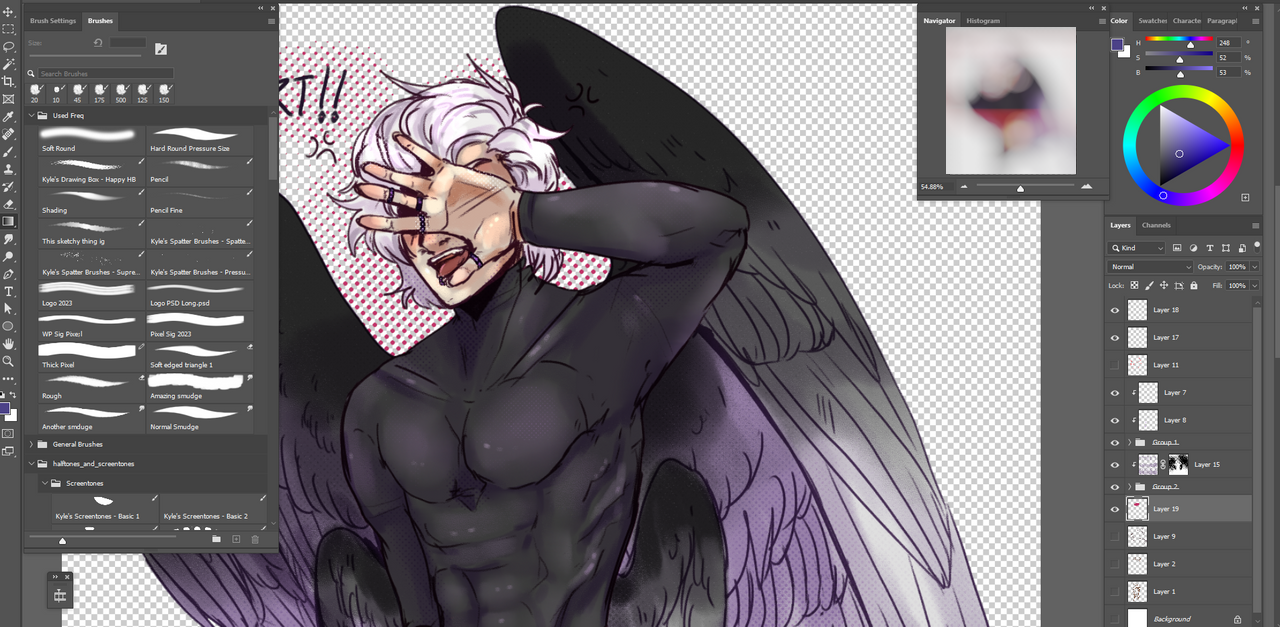 So I keep it very minimal so I don't get confused!
And thank you so so so much <33
-----
Onto some more art. A traditional turned digital doodle of Apollo <3 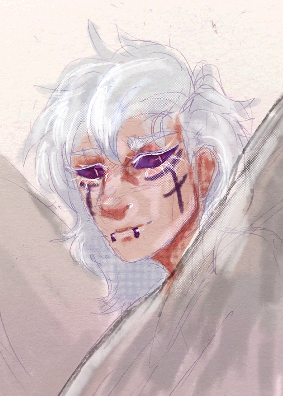 Annnd some doodles of varying quality from my D&D campaign. 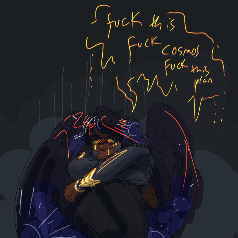 All art on this post is [c]157083 Eternity [WPG] [DA] [TH]
My alternate online handle is 86Eternity
| Art on this thread may not be reused, reposted or repurposed. | | |
|  |
|
| |

Game Moderator
Darkseeker
|
More art of some of my favourite dudes <33
Karesh showing off his nice handprint scar,,
And Apollo being shy, as usual. All art on this post is [c]157083 Eternity [WPG] [DA] [TH]
My alternate online handle is 86Eternity
| Art on this thread may not be reused, reposted or repurposed. | | |
|  |
|
| |

Neutral
|
Eternity - Oh I appreciate this a ton! Thank you so much dude! :D The simplicity and personalized layout is great, and I have my own setups on Krita, so I might be trying this with Photoshop later. Also, Eternity Photoshop Layout Reveal?? (eyes) hahaha - Apollo looks great here! I appreciate the texture of the paper staying in the image, it's a nice touch. And I also like how the scenes from the D&D campaign are rendered to a certain point! :D - As Aang says, hello hotman! (Hat tip) Hotman! Lol, and Karesh having a handprint scar is so stinking cool and unique. :0 |
|
|
| |

Game Moderator
Darkseeker
|
Yuketa said:
Eternity - Oh I appreciate this a ton! Thank you so much dude! :D The simplicity and personalized layout is great, and I have my own setups on Krita, so I might be trying this with Photoshop later. Also, Eternity Photoshop Layout Reveal?? (eyes) hahaha - Apollo looks great here! I appreciate the texture of the paper staying in the image, it's a nice touch. And I also like how the scenes from the D&D campaign are rendered to a certain point! :D - As Aang says, hello hotman! (Hat tip) Hotman! Lol, and Karesh having a handprint scar is so stinking cool and unique. :0
No worries! :0 Photoshop is a tricky program, I'm always happy to help out! I'm still learning tips and tricks to speed stuff up on the daily. Thank you aa <33 I do appreciate it. LMAO- and more thanks <3 The handprint,, took a few seconds to work out, I'll say that. Lots of smudging and colour overlays. --- God it's been a second since I've posted. I don't have much to show. Classwork. 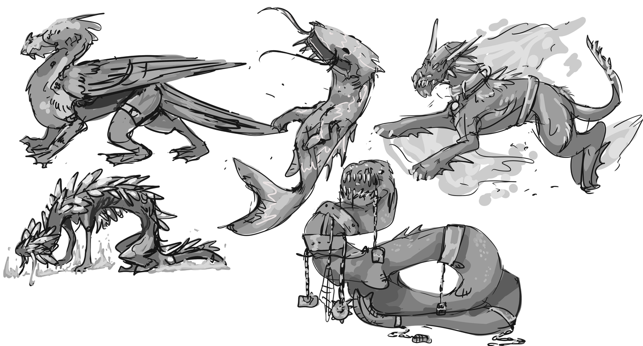 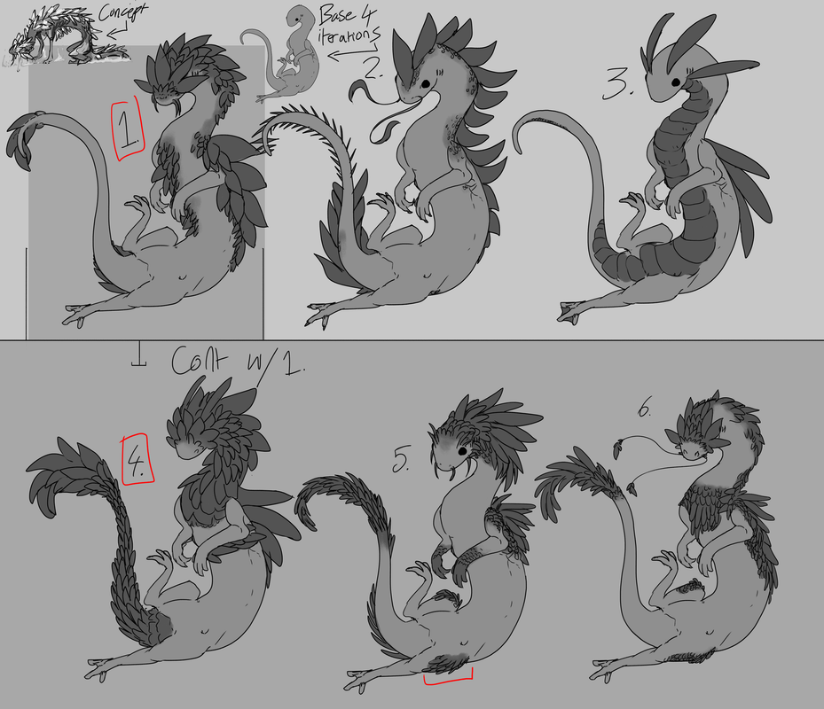 All art on this post is [c]157083 Eternity [WPG] [DA] [TH]
My alternate online handle is 86Eternity
| Art on this thread may not be reused, reposted or repurposed. | | |
|  |
|
| |

Neutral
|
Eternity said:
Yuketa said:
Eternity - Oh I appreciate this a ton! Thank you so much dude! :D The simplicity and personalized layout is great, and I have my own setups on Krita, so I might be trying this with Photoshop later. Also, Eternity Photoshop Layout Reveal?? (eyes) hahaha - Apollo looks great here! I appreciate the texture of the paper staying in the image, it's a nice touch. And I also like how the scenes from the D&D campaign are rendered to a certain point! :D - As Aang says, hello hotman! (Hat tip) Hotman! Lol, and Karesh having a handprint scar is so stinking cool and unique. :0
No worries! :0 Photoshop is a tricky program, I'm always happy to help out! I'm still learning tips and tricks to speed stuff up on the daily. Thank you aa <33 I do appreciate it. LMAO- and more thanks <3 The handprint,, took a few seconds to work out, I'll say that. Lots of smudging and colour overlays. --- God it's been a second since I've posted. I don't have much to show. Classwork.   All art on this post is [c]157083 Eternity [WPG] [DA] [TH]
My alternate online handle is 86Eternity
| Art on this thread may not be reused, reposted or repurposed. | |
Aaaaa thank you! Yeah, I bet there's always new stuff to learn on the program lol. <3 <3 <3 More <3 lol, and I see! Smudging and color overlays, that seems about right. The gentle golden flecks of dotted halftone makes for such a great subtle detail. - Now onto those iterations - Eeeeeeee you're learning character design in class? These are amazing, and done very cleanly! I agree with 1 and 4, covering the eyes with scales was a fantastic idea. If you continue project into further iterations, creating color palettes, and further detailing, that'd be lovely to see! :0 And what a slippery slinky boi this is. |
|
|


