| |

Neutral
|
As you can see, this is a work in progress haha.
I'll try to put up very basic art tips here whether it's about color, anatomy, composition, etc.
If you have any questions, go ahead! But if you have pictures, please PM them instead of posting them here!
am I an expert? HA nope. but this is how I do things, so I hope that this'll help! I'm self-taught, if that helps with anything.
This is basically all the information I have compiled or noticed over the years. Perhaps not every tip will be perfect or useful to you, but I hope that something benefits somebody. Art tutorials and tips online have helped me, and some of these tips have come from them.
Just because I have these tips does not mean you can never or always do something because I recommended it. That's actually a terrible way to look at art tips. There will always be exceptions because everyone does art differently and art follows no rules. However, these will give very basic ideas that you can incorporate. Never set these rules in stone.
Things you should look up on Google because Google is A Thing
- [what you want] art tips tumblr or deviantart - [what you want] anatomy tips art tumblr or deviantart - color tips art tumblr or deviantart
tumblr and deviantart are personally the best sources for art tips. By "[what you want]", I mean that it can be wolves, horses, humans, paws, lips, hands, etc.
Watch speedpaints on YouTube and watch the processes of other artists. You'll learn what and what not to do and what YOU want to do, too.
To the mods:
https://s20.postimg.cc/yueg2vcwt/image.png https://s20.postimg.cc/tvqxocojh/New_Canvas.png |
|
|
| |

Neutral
|
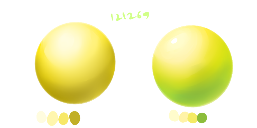
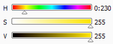
Hue: another name for ""color"" Saturated: very bright Unsaturated: not very bright High value: lightness. like white. Low value: darkness. like black Shading You'll always hear to not shade with black. Of course, sometimes black will be necessary. But the reason people say this is because black (and white) tend to make your colors unsaturated; instead, make sure to change the hue (color) AND your value. Values are very important! So: don't RELY on black and white to shade and highlight. They will be necessary, but learn how to navigate through colors besides these shortcuts. A great example of this is yellow. If you have a yellow object and you shade with black, it's just... dull. However, if you darken the color and shift the hue from yellow to orange or green or something, your product will be much nicer. This goes to highlights as well, as white also tends to wash out colors. H: HUE S: SATURATION V: VALUE  The left was shaded with black. On the right, I shaded by changing the hue to blue (it turned out green :p). It pops a lot more on the right. I just the #ffffff to highlight special areas. But that's me. |
|
|
| |

Neutral
|
If something looks wrong, try flipping the image. You'll be able to find little mistakes because you'll be looking from a different angle.
If you are able, flip the image AS you're drawing. You'll pick up the mistakes before it's way too late. wow, that just sounded ominous lmao Edited at April 8, 2018 12:38 AM by a m b e r |
|
|
| |

Neutral
|
To draw something new, you have to learn it and memorize it!
If it's a tiger or something and it's a bit difficult, try to break him up into parts. Do an eye. Do his paws. Do his mouth. Do each step with each part you're breaking him in.
So, you want to draw something. Get a picture of it and draw it to get used to it. Good.
Put that and the reference away. Draw the subject again. If you're forgetting something, refer back.
Once you're used to it, draw it now without the reference at all! Now find where you made your mistakes and work on fixing them. You're an artist, and now you're trying to improve as one.
imo, this is literally what learning how to draw is. Edited at November 7, 2018 07:07 PM by a m b e r |
|
|
| |

Neutral
|
|
| |

Neutral
|
Know the basic anatomy of something before you try to stylize it, or at least, try to.
This was on the Internet somewhere, but someone brought up Picasso. The point was that even though you may think that his art looked like it was done by a five-year-old, he DID master anatomy. Take a look at his earlier works; they're pretty good. Conventional, I guess. He made sure he knew what he was doing before he took it apart.
That being said, it's not helpful to grow as an artist if you pass off bad anatomy as "your style".
Go on deviantart or tumblr and look up "[what I want] art tips". You'll get so, so much good information if you just know where to look.
If you compare art that is stylized vs art with bad anatomy, it is very obvious to tell which is which. Edited at July 15, 2018 07:55 PM by a m b e r |
|
|
| |

Neutral
|
Huckleberry Pack said:
Good tips <3
Thank you!! |
|
|
| |

Neutral
|
This is a horse tutorial I made like a year ago. I would change some things, but this still has some pretty basic tips.
http://i65.tinypic.com/2q00s9u.jpg |
|
|
| |

Neutral
|
Style
A classic tip to try to develop your own style is to take pieces and bits from what other artists do. This does not always mean to copy them. It means to learn from whatever they're doing.
Things to notice from other artists:
- Do they seem to do everything on one layer or multiple? - Do they have lineart or did they go over it, or none at all? - What kind of colors are they using? (high/low saturation and high/low value and what colors on the color wheel) - Do they use brushes, textures, or layer modes (overlay, multiply, screen)? - How do they use cool and warm colors on the picture? This does not mean red, orange, yellow and blue, green, purple. You can have a "cool" toned red, but I'll try to go over this stuff in another post.
Your art WILL be influenced by other artists! Take things you like about other artists and incorporate them yourself! Experiment a lot! Edited at November 7, 2018 07:09 PM by a m b e r |
|
|
| |

Neutral
|
|


