| |

Neutral
|
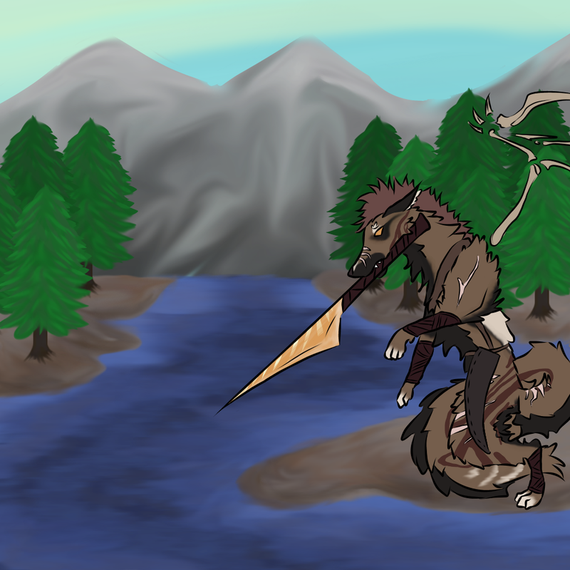
I have this art piece I am working on: (c)203451 OC is not mine by the way ------------------------------------------------ I have 2 issues (sort of): 1) Background-I like river and mud,they look nice thou river is bit lifeless-I think some shimmer might help? BUT mountains don't look okay at all ;-; and forest is not very good either. I'd like to know how to make decent mountains T-T and any idea for improving background is welcome, it's WIP, I plan to add low grass and pebbles (they won't be much,but I think they might add to art nevertheless) 2) Character-I'll try to give it harsher shading then usual, airbrush?, with halfshadows too. And I'll color lines so they blend in more..? Gotta see how that will turn out. Any comment and advice is welcome ^^ but I might be bit of a perfecionist or asking for too much from my current skills |
|
|
| |
Neutral
|
I made two versions ^^""" of shading and stuff ------------ First, with purple and light yellow (highlights) (c)203451 Second, red I think for shade and light yellow for highlights (c)203451 ----------------------------------------- I like 2nd one more, cause red somehow blended better, in purple you can see it's purple shadow and depiste me liking that in some styles I think this one is not working with it well. Are shadows deep enough? Any advice welcome uwu |
|
|
| |
Neutral
|
My tip: Though I love it, and this advice is optional, I think are more life to the actual river. Fish leaping out, birds trying to fish, an eagle perched in a tree, etc. Snow added to the tips of the mountains as well, since most do have some light powdering because its so cold up there. A filtering of sunlight to support the river shining would be great too. |
|
|
| |
Neutral
|
Second tip, this is for the character: Unique design, but he seems a little flat, sorry if I sound rude. What I mean is perhaps add some reflection of the light against his eyes and a shadow of silhouette to give him more of a shape. Just a suggestion, don't take my words harshly. |
|
|
| |
Neutral
|
Thank you on advices, adding details to river and mountains is good idea ^^ and for character flatness :') yeah I am still fighting there, one day I'll suceed |
|
|
| |
Neutral
|
1) The water needs a bit more contrast, right now it looks very blended and murky. I think you're right about adding shimmer so that there's more contrast in the water. If the river is calm then you can add some sort of reflection with the trees or add hues of green or brown to the water, and if you want you can make the weapon the character is holding to reflect onto the water. The shimmer can be the color of the sky you made to show a bit of reflection. I think the trees appear to be pretty short and they seem to be pretty close to the character, so there is a bit of a problem with the size of the trees. The ground under them isn't shaded either. I like the shading you did with the leaves, it helps make them appear less flat. The mountains are pretty smudgy too, and it appears to be smooth instead of rough like how rocks are. Try not to use smudge on rougher surfaces and use brushes with harder edges to make it more defined. 2) I'm not so good with characters, but I agree with you on the shading. The 2nd version matches better with the kind of shading you did with the background. Having a shadow underneath them would help. |
|
|
| |
Neutral
|
Thank you too, it sounds helpful :3 and good thing you reminded me of shadows x3 I forgot about those |
|
|
| |

Forum Moderator
Darkseeker
|
1.) The river looks really dark to me, so maybe try adding some light. Real water looks like it has a lot of light streaks across it if you look at it from a similar angle. As for the mountains, they look a lot smoother than they should. Maybe try finding a small speckle brush and giving the mountains a little bit of a rougher look. . 2.) The red shadows look better, since there are a lot of warm colors in the art. . Sorry if any of this seems harsh, it wasn't meant to be. I can PM you some examples of water and mountains I have if that helps. |
|  |
|
| |
Neutral
|
@Evergreen, it's not harsh in the slightest :D your comment is valid crituique and helpful :3 also example of mountains would be great ^^ |
|
|
| |

Lightbringer
|
1. I think the river looks great! The shading is well done and true to the style of the piece. Although I think it looks fine now, if you want to give it some life, make it be a bit choppier. At quick and deliberate strokes of white throughout so it's as though the small waves are crashing down - I know how to do this traditionally, but I'm not sure how you might achieve this with digital. The only other critique I have for the river is making it thin out the farther back it is to get some perspective. Then add some sort of ground so it doesn't immediately transition into the mountain.
So, for the mountains - I really do like the smooth shading. However, mountains are rocky and angular. The shading should reflect abrupt shifts in light and shadow where the rock drops off or juts out.
This was my attempt at mountains. All my strokes were short to reflect the lack of a smooth surface, and I tried my best to keep the lighting to one side, although I could have done much better with that. So that's a second point - lighting! Make sure you know exactly where it's coming from, and shade accordingly. .
2. I actually prefer the second version of the character. I think it looks good, and I really don't have any shading or stylistic critiques ^^ |
|
|