| |

Darkseeker
|
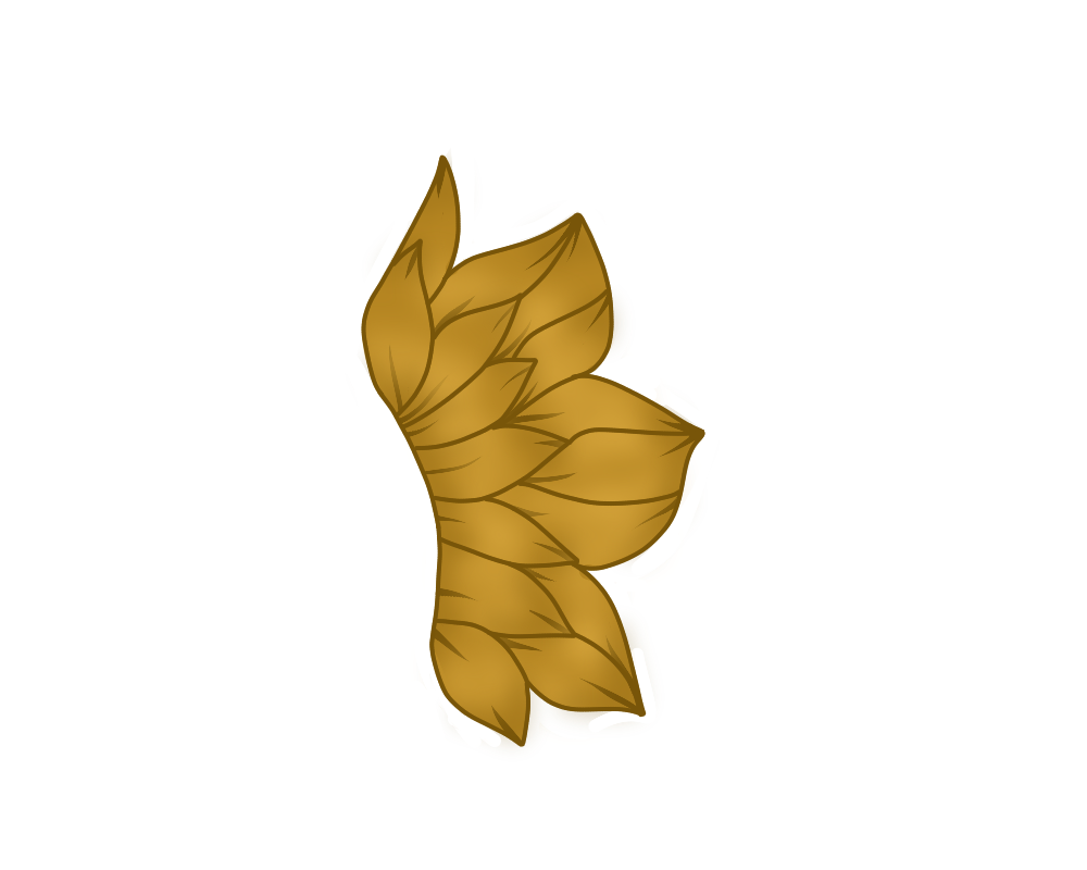
I wanna improve my shading because I feel like it makes my art look better. My shading technique is something I've used since I've started drawing but it doesn't look good to me. (c) 243831 My style heavily revolves around the way I draw floof, so I would like to make it detailed to make it look nicer aha I work with my finger and Autodesk Sketchbook, and if you're unfamiliar with the program, I just have different brushes :P. I still have the same layer functions of any other program aha I've looked at endless tutorials, but when I try to incorporate them into my style, they just look bad. Or maybe it's me I dunno- All posts are appreciated! |
|
|
| |

Darkseeker
|
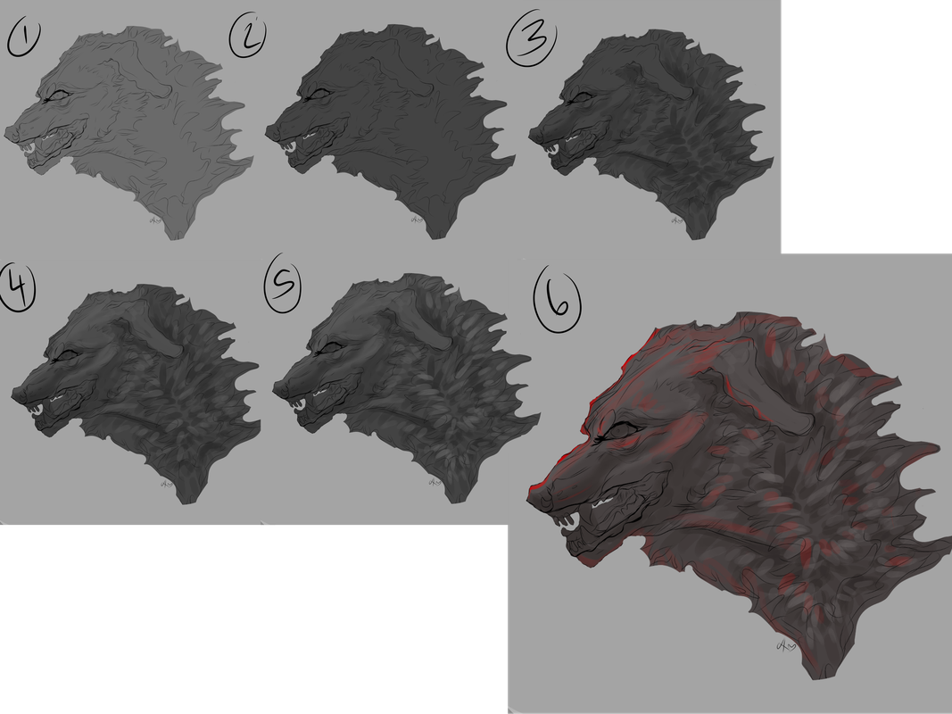
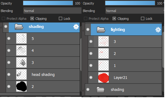
please note the shading and lighting here was rushed and done in like 5-10 minutes so its not the best example lol. also the image is clickable so you can see it better. if none of this makes sense, dm me and i can probably explain better lol. im not very good at explaining things. (c)152281 BREAKDOWN OF THE STEPS: 1. do your flat colors 2. take a darker color (i usually color pick depending on the color scale of the character - i.e; greyscale characters i would choose a dark grey or black and brownscale characters, i'd choose a dark brown, etc). make a clipping layer and fill that whole layer. mess around with the opacity till you see fit. 3. i use the pencil tool on medibang and this step is heavily reliant on pen pressure. i keep using the same color from step 2 and draw dark strokes following the fur direction. i darken the areas where needed. i use the pencil tool on medibang for this because it allows me to make lighter colored fur strokes when applying little pressure and darker when applying more pressure. you can replicate this step if you dont have pen pressure by making 2 separate layers and messing with opacity! :) 4. make another layer & mess with the opacity. i go in with a lighter color (usually the base color/original color of the area im working in). this step is to mimic areas where the light would hit your character. 5. same as step 4, just using a higher opacity layer to enhance the lighter areas. 6. final piece! i like adding dramatic lighting, but this part is completely optional and usually just follows the same process as before. LAYERS: |
|
|
| |

Darkseeker
|
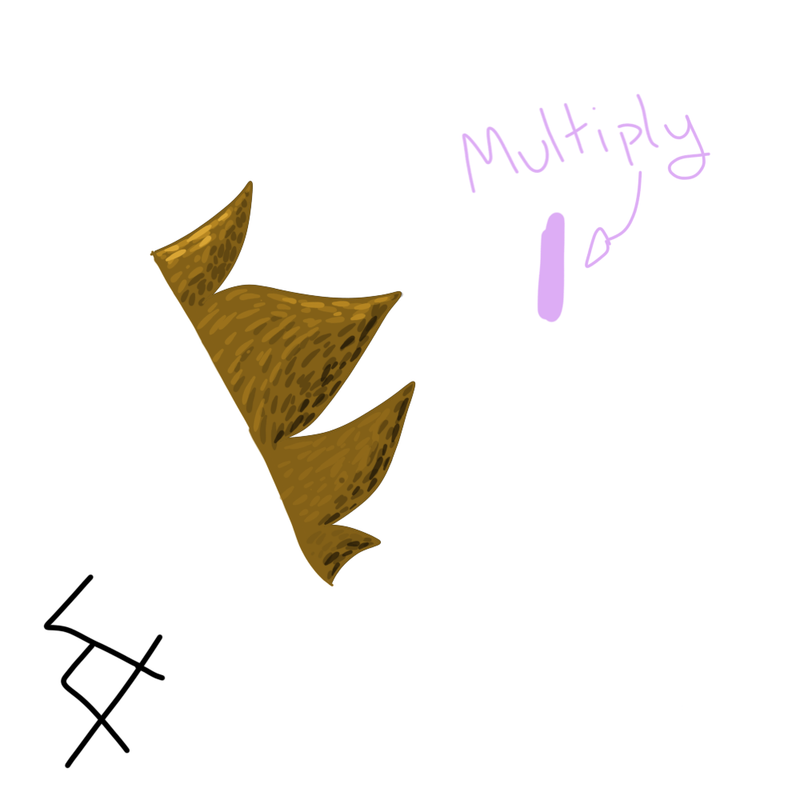
:O Wow! That's explained really well! I really appreciate it! I'll definitely give this a try! Ignore the Multiply thing qwq But..like this? 
|
|
|
| |

Darkseeker
|
a bit! i tend to use a bigger pen size though :)
Excisus said:
:O Wow! That's explained really well! I really appreciate it! I'll definitely give this a try! Ignore the Multiply thing qwq But..like this? 
|
|
|
| |

Darkseeker
|
When I was worried about using too big of a pen size x'D Thank you! |
|
|
| |

Neutral
|
No clue, but could you PM me if you figure out a way? Our floof styles are very similar ;0; Been having the same problems 👉👈 |
|
|
| |

Neutral
|
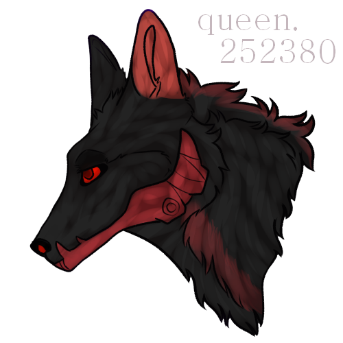
i don't have any way of showing it right now, but what i do is i will take a color that compliments the color of whatever i'm shading (grayscales i use purple or blue, browns i use red, and everything else it just sorta depends). i lay down a flat base of that color and then i use a watercolor brush that is transparent (i think it could work if you set the opacity to 0? i'm not sure, but i use medibang so i just use the options there), and i make a fur texture. it ends up looking something like this:  i also do the same thing with my lighting ^^ hopefully this helps aha. i'm not sure if it would fit your style, but i do hope you find something that is unique to you! |
|
|
| |

Neutral
|
I forgot to save this in steps, sorry :'^ - 1, Make the basic outline 2, Add the smaller lines, flowish curves, along the others 2.5, Add a small line on both sides, just a simple stroke! 3, Base color! (I used the same color as you) 4, Lighting! Use a normal brush, with the color lighter then the base! Should look like a light variation of that color 5, Make 2 lines inside the fur lines with a normal brush with that color 6, Duplicate the layer! 7, Blur the lower layer a bunch 8, Delete the top lighting layer, cut out excess lighting 9, Take a darker version of the color, trace the outline of the for tips, on both sides 10, Repeat step 6-8 with the darker color 11, Color lines - Should be done, lemme know if you have questions :] (The brush size for the lighting and shading sould be middle-sized!) |
|
|
| |

Forum Moderator
Darkseeker
|
ET but what colours do you use?
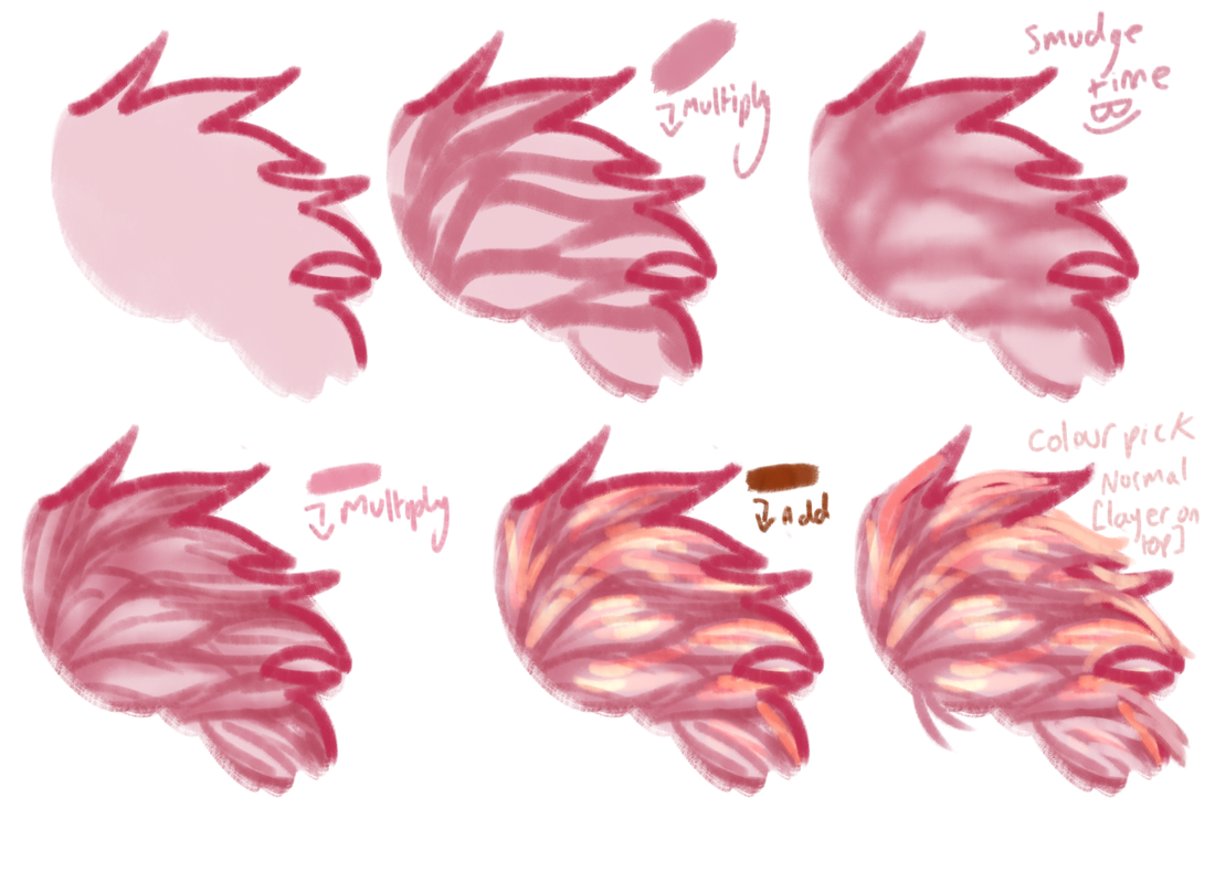
Just,, guess, I don't know, use colour theory, or don't. I just do whatever and adjust colours if I don't like how it looks.
Use less saturated colours [less colour, more grey] if you want the shading to be close to your colour layer. If you want something that looks wacky, use very saturated colours.
If you like cell shading, don't smudge it, if you want more detail, repeat steps over and over. [Also I forgot to mention I used multiple smidge brighter tones in the add section lolol]
If something is too strong just adjust the opacity!
Basically, try and split your fur tufts into multiple smaller fur tufts. Follow the general direction of the fur.
Make some bigger ones and some smaller ones, variation is the spice of life!
Edit: Forgot my credits lolol [c]157083 don't nerf me mods <333 Edit2: THIS SHOULD WORK WITH JUST ABOUT ANY BRUSH-- This is all done with one brush, excluding the bit I smudged. If you can't smudge, blur should work just fine!
This is just one way I shade, I can try and dig up some others if they're needed! Edited at January 9, 2022 02:16 PM by Eternity |
|
|
| |

Darkseeker
|
:O Appreciate the help everyone!! |
|
|


