| |

Neutral
|
hey there! im an artist, i know realistic anatomy (it's not featured in the style i currently use because i dont feel comfortable sharing my actual one on this site, theft y'know?) so i thought why not make a forum where struggling artists can post their artwork and get a couple tips from me to fix the anatomy if it looks a lil' weird. i can redline, or just give a couple words of advice! i can help with the anatomy of felines, canines, anthros and humanoids, though don't be afraid to ask about any others, i'll try my best to help with those, too! just post your art, credit it correctly of course, and say if you want redline, tips or both! i'll try my best! :D |
|
|
| |

Lightbringer
|
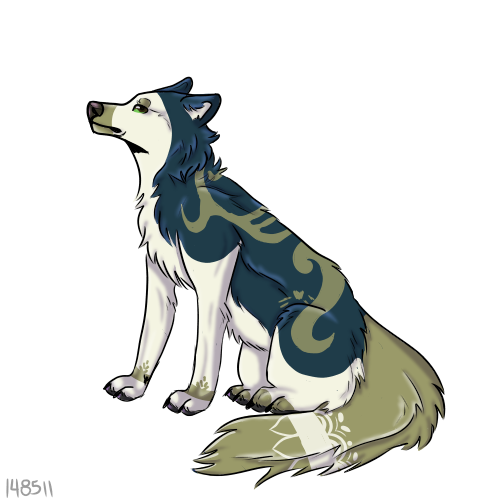
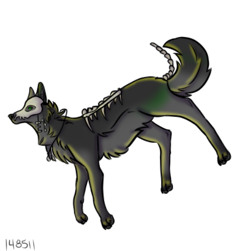
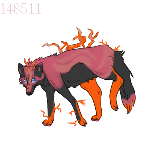
I don't think I actually struggle with anatomy, but I would love some new pointers! My style is more on the cartoony side with realistic proportions, I guess? I'm not too sure what you would call it, but here's some of my more recent pieces; Note: All of these do belong to me. Please do not steal. >:    I say that I struggle most with the legs, especially paws at times. I've done minimal studies with them traditionally, and it's helped a bit, but more pointers on those would be greatly appreciated! And just anything in general, doesn't have to just be on paws :) You may redline if you want, though tips are just as good |
|
|
| |

Neutral
|
Corpses said:
I don't think I actually struggle with anatomy, but I would love some new pointers! My style is more on the cartoony side with realistic proportions, I guess? I'm not too sure what you would call it, but here's some of my more recent pieces;
Note: All of these do belong to me. Please do not steal. >:
I say that I struggle most with the legs, especially paws at times. I've done minimal studies with them traditionally, and it's helped a bit, but more pointers on those would be greatly appreciated! And just anything in general, doesn't have to just be on paws :) You may redline if you want, though tips are just as good
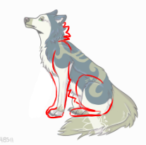
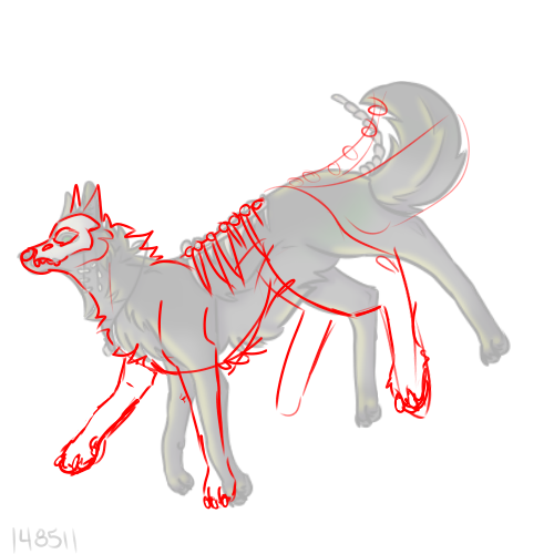
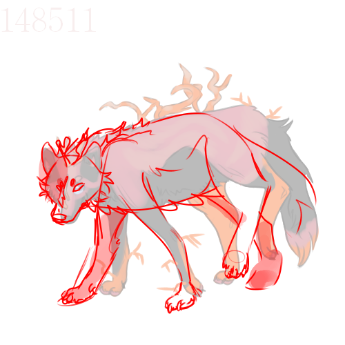
hey there! i've come up with a couple redlines and sme extra tips/explaintaions for each one! 
here's the sitting one! the only thing with this one is i felt the right front leg was a little too far forward, since it has no curve to it, it doesn't appear like it's attached to the same place at the shoulders like the left front like is. in order to keep the leg in that placement, it would have to curl back towards the shoulders and land at a reasonable distance, or, of course, just be back a little further. for the shoulders i changed how they were positioned a little too, because it was placed forward like the leg was tilted back slightly, however the leg went straight down, so i made the shoulder match that. as well as the armpit-y bit of the leg not really existing and just having the skin, which does go up a little too far. as with the right hind leg, i felt it was too far forward too. as well as the left hind not being large enough. i made the right hind pretty much not there, you may want a little bit of the haunch visible, but not the paw. i also made the paws a little flatter to look like they do in fact touch the ground and also added a little more fluff at the neck so the line from the head to the neck was a bit more flat. something i forgot to touch on in that the line between the chest and the belly does not follow through and you can see that is curves inward at a point which can just make the piece look a little odd. 
i did a little more lining for these last ones, so on this one again, shoulders not being in the same place. haunches not being in the same place, same thing as last time. the thing with this one, i found, was that it looked more like the character was standing diagonally more than floating, which i assume was the intended position. so i changed the leg positions to match that assumption, something i find with your poses thus far is that they lack life, i suppose so i did add some more life and a simple way you can do that is changing the limbs to where there would be muscle tension rather than just a very neutral position. i also think the body seemed a little bit too long so i shortened it. with the spine on the back, i changed it so that it looked more flat, since the canine's body is facing straight and has very little tilt, it looks odd for the bones to be facing as if they are, so they're just more fitting to the way the body is. more fluff on the neck, made the tail curl less because in this position it's more likely the tail would not curl and be in a more neutral position, as it is a neutral pose. also a tip for skulls!: it's much easier to draw the skull's frame and then the teeth seperately, also at the nose bridge the skull did not like... expand from the lineart if you get what i mean? also, the line between the chest and belly. 
and for the last one! for this pose i changed it more so that it's more like the rigth front paw is just being placed than the left being picked up, beause two paws on the same side being lifted would definitely result in them falling over lol. shortened the body, shoulders and haunches matching. changing the right hind to be back to balance weight a little better, and also the character does seem to be walking and once that left hind is placed, the right hind need to go up and it will go up from the backwards position. due to the head position being slightly forward and the body being sideways, it looked a little odd so i added the shoulders facing a little forwards so the transition looked a little more natural. i made the ears a little bigger, and edited the head shape. the muzzle went too far sideways considering the position the head was in and the eyes were not angular enough. also, the line between chest and belly was sorted. overall ending notes: you need to make the shoulders and haunches match positions, your paws need to be a little flatter, your bodies need to be a little shorter and sometimes it's better to draw the muscle attachment from the front leg to the body rather than the skin connection. your poses need more life and angles should probably be worked on a little more. it was fun doing this! thank you! |
|
|
| |

Darkseeker
|
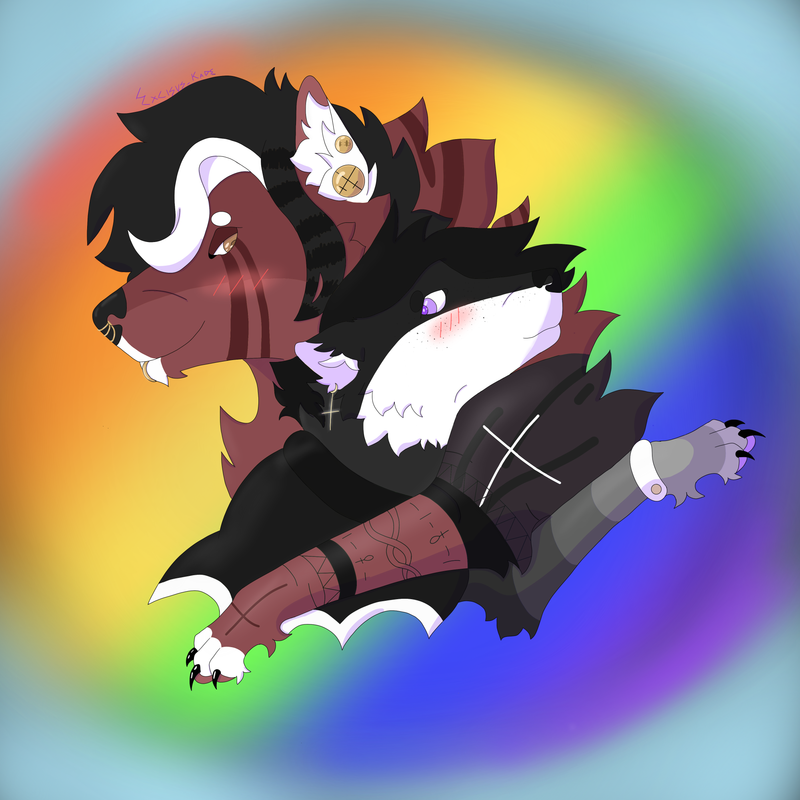
I really struggled with the shoulders/arm placement in this piece specifically, because I've never drawn two wolves together like this 
--- The sitting pose gets me everytime aha, and I'm not sure if the wolf off to the right, anatomically looks correct either ^^" Thanks for your help! 
|
|
|
| |

Neutral
|
TKO said:
I really struggled with the shoulders/arm placement in this piece specifically, because I've never drawn two wolves together like this --- The sitting pose gets me everytime aha, and I'm not sure if the wolf off to the right, anatomically looks correct either ^^" Thanks for your help!

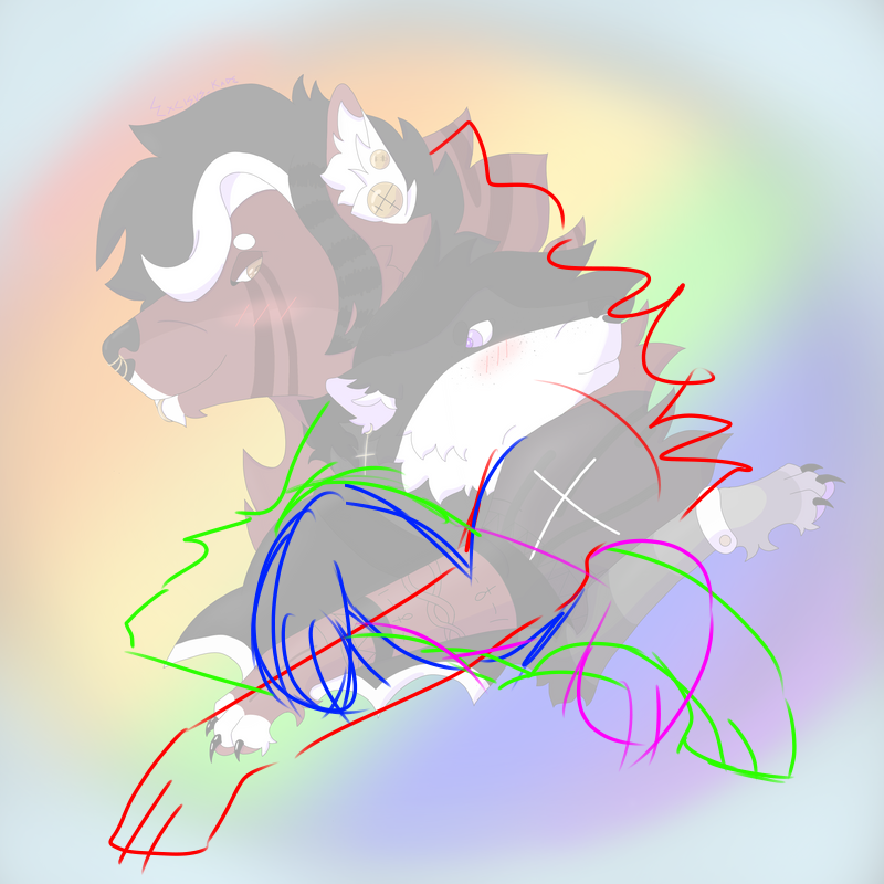
so this one... is a little confusing to look at. i had a couple simple options, the legs were way too short. and this a full length outretched one would not fit on the canvas and would make it a little gangly, however i did of course include that option. (red and green) however i think the better option is blue and pink, showing the arms folded so that they fit in the piece, aren't gangly, and also just feel a little more fitting. another thing for something more realistic could be making their eyes more angular but that can always be a style choice. 
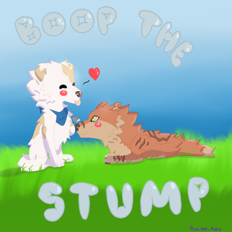
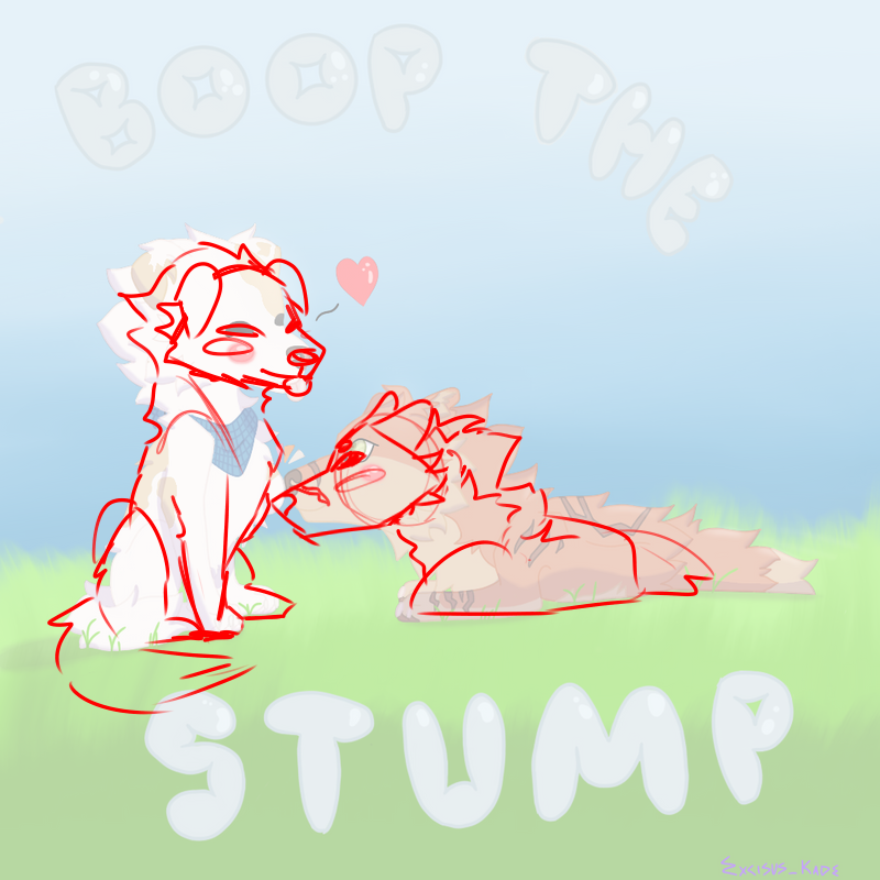
changed a lot on this one! so for the orange dog, the issue lays in their leg, it makes the position a little confusing. i think what you were going for was like this image in the colouring book a little?  so i did end up just deleting the leg and making them lay with their body sideways and the head upright, the shoulder still visible since the leg is there, just behind the body. for the white dog, the sitting position was very off, yes. their body started getting too small as it went down. their head needed some fixing too, the ears went too far back and considering the body's angle, the head position was a little bit incorrect. the leg was a bit too far back so i pushed it forward but then the stump was a little too far forward to i pushed it back, that did make me need to edit the red dog's head to reach it since they boopin. i made the rear end a little bit bigger as well as making the hind leg go in front of the front, since when sitting animals usually would put their fronts in centre and hinds outwards beside them. also made the hind leg kind of protrude from the back since they're kind of sitting with the front pushing it backwards a little? im too sure it just kind of look more right xD though i do believe this piece is a chibi style and i am editing it to be more realistic, and since i have no chibi style, i cannot help in that sense. |
|
|
| |

Neutral
|
Go ahead, criticize,tips, redline, whatever. It really wont hurt my feelings. ^^ |
|
|
| |

Neutral
|
Interstellar Ivyleaf said:
Go ahead, criticize,tips, redline, whatever. It really wont hurt my feelings. ^^
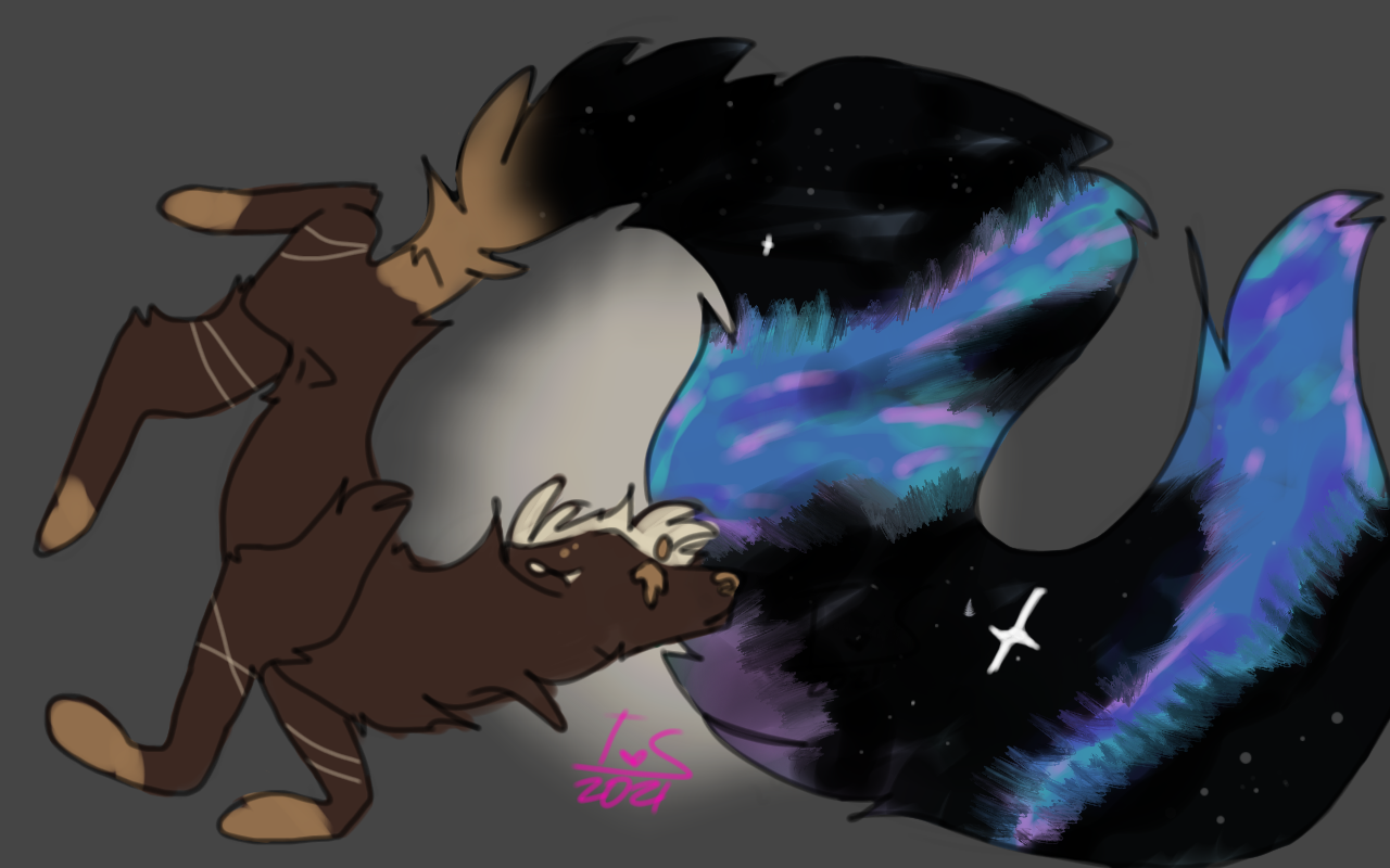
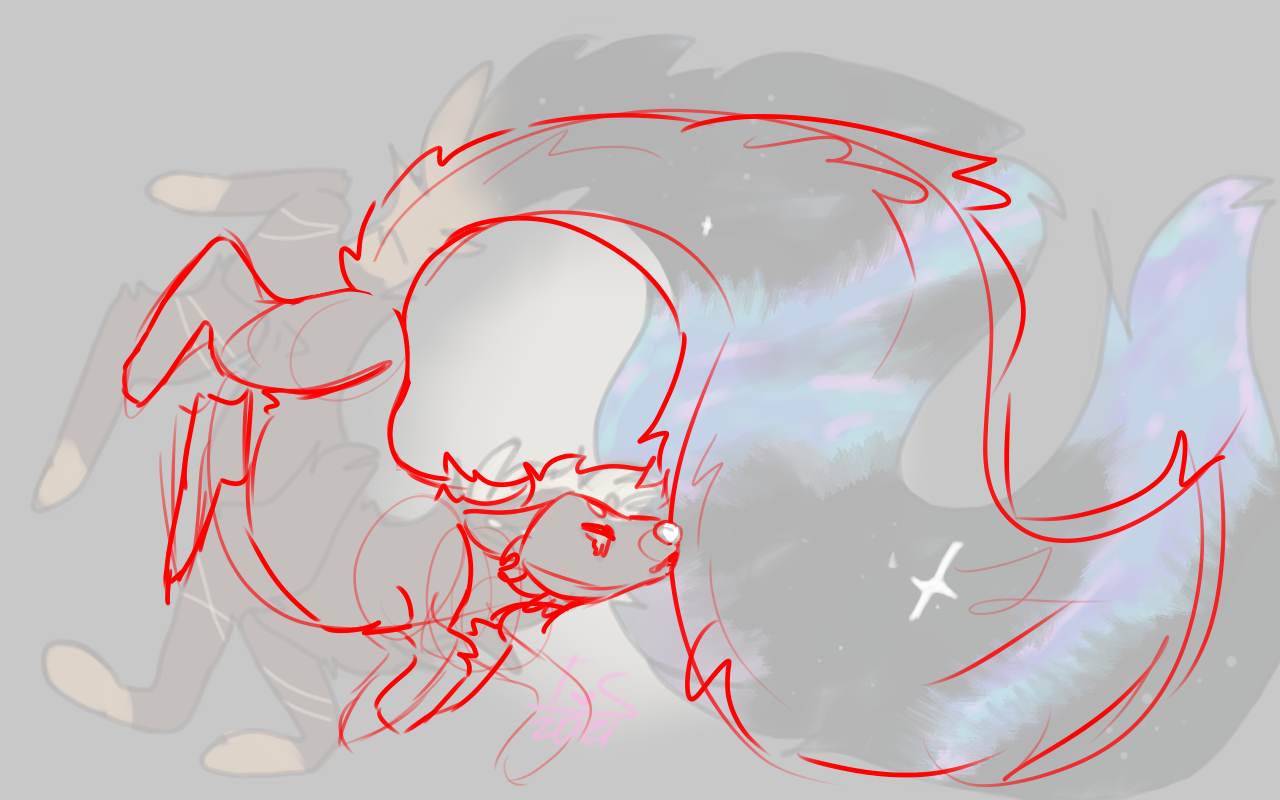
okay, so i think in this piece you made the fur go in, rather than out. im guessing this is the case due to the chest fur and the little bit where the haunch meets the tail, as well as the tail itself. first i do want to give overall positive comments: your head shape is pretty good. the muzzle shape is spot on and the eyes are pretty angular too. you made the chin the right size, my only critique in the head department may be the add cheek fluff and to draw the ear after the head is done, it makes the ear suit the position it's in more. your leg lengths are really accurate which is lovely to see, as well as the paws being stiff to the ankle. the size of the body at points does change in a correct-looking way, making it seem like the rear of the body is leaning away from the "camera". i think you need to work on making the body a good size, because the back is curling inward but the belly is not being out to accomadate that, so that needs to be shown. in my redline, i moved the front legs towards each other a little bit, it gives more of the illusion like the character is floating, and that they are bending to face the way they are; because at some point they're gonna need to stop floating, and to manage weight they'll need to land on the two front paws. i made the left hind leg more correct, brought it in a bit more and made it shorter because it was a little bit too long, and also a little too far back. another thing is the shoulder on the right front, for firsts, the leg itself is angled, but the shoulder isn't, also the fur on top of the shoulder without having fur on either side is a little obnoxious. the leg is completely closed off from the rest of the body, which usually doesn't look good, especially if the other legs aren't. i want to elaborate further on the way you draw fur: it goes "inwards" which makes the body that the fur is on seem a lot smaller than intended, it just makes everything look a little off. the tail looks pretty good, the curls seem pretty okay for the size that it is, but again, the fur goes inward so it looks a little odd. in the redline, i redrew the fur where i think it would go. 
i also made a little sketchy colour-in of the tail, i thought the colouring was a little jarring and tried to redraw it looking a lot smoother, as well as changed the stars a little. |
|
|
| |

Neutral
|
Thank you so much! It really helped, and this piece is actually from a few months ago so I've been slowly figuring everything out. The shoulder is one of the things, as well as the weird fur. I was going through some weird phase lmao. A lil sketchy dude from yesterday, to maybe show what I mean. I still suck at ears and hooves though. Its basically just a random doe sketch because a deer was outside my window. |
|
|
| |

Neutral
|
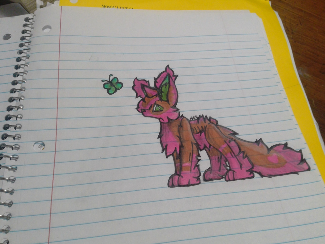
Hey, could I have some help on this? I really struggled with the placing of the legs and stuff Sorry its traditional. Scorpius is supposed to be skinny with a extreme amount of fur, so I kind of need help on figuring out where to place his limbs in a place it wont look bad. |
|
|
| |

Neutral
|
Jschlatt said:
Hey, could I have some help on this? I really struggled with the placing of the legs and stuff Sorry its traditional. Scorpius is supposed to be skinny with a extreme amount of fur, so I kind of need help on figuring out where to place his limbs in a place it wont look bad.
i'm not gonna redline this one, but i do have some tips. you have a good head shape, it's not something i see all too often. good job. though, i do feel your ears are much too large, as well as the tufts. even with a large amount of fluff, ear tufts are only ever small. i think the main issue is you're trying to make the skinny still visble, which is something you wouldn't see if they were fluffy; though, if you do want to make sure people know it's fluff and that they are skinny, you can add faint fur lines where the skin ends (like what you did on the legs, but a lot less so). I find that shows the viewer that the charachter is skinny right off. i think the leg placing is good, however, i never reccomend making the legs kind of "closed off", it makes your art look a little odd. though admittedly this may just be a pet peeve of mine aha i'd also suggest keeping the back flat, usually fur won't go up along the dorsal, at least not in clumps. just in little spikes around the shoulders or hips. never right on the back. overral i don't find much wrong with this. I think your big thing is just how the fur is shown. |
|
|


