| |

Neutral
|
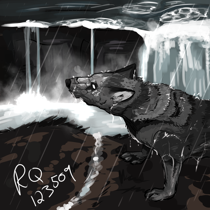
I drew this waterfall painting and there is some disagreement among my real life artist friends as to whether or not something looks off with it. I was hoping for maybe you guys could help me cx How can I make the waterfall look better? |
|
|
| |

Darkseeker
|
Is that a giant wolf? Or a mini waterfall? I dont know but when I look at it I cant tell if hes standing across from the waterfall on a higher or lower point and it makes him look huge 😂 unless hes meant to be huge??? |
|  |
|
| |

Neutral
|
Dark°Halo said:
Is that a giant wolf? Or a mini waterfall? I dont know but when I look at it I cant tell if hes standing across from the waterfall on a higher or lower point and it makes him look huge 😂 unless hes meant to be huge???
The waterfall is supposed to be off in the distance...so yeah that's the problem I guess. Maybe I need to change the colors. |
|
|
| |

Darkseeker
|
It should probably be darker down at the bottom where it flows out |
|  |
|
| |

Neutral
|
I'd lighten and desaturate the waterfall in the background, potentially lower the top edge(?) of the waterfall a little to give the appearance of being off in the distance (also to help with the perspective of looking down on it). A few of the ripples also give the appearance that it's up close as it doesn't quitee look to scale at the distance that I think it's supposed to be at.
However, it does look gorgeous! Great job! |
|
|


