| |

Neutral
|
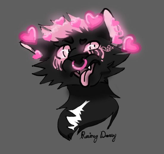
Mostly looking for advice on coloring/color choices and making things more vibrant and pretty. There are some anatomy things I'm aware of, but I'm slowly trying to fix those and they vary from piece to piece. |
|
|
| |

Neutral
|
New art, who dis? Both for Doll (#186437), character designs belong to her. -- --
 Any advice on how to separate the parts of the body more distinctly (the shoulders from the back, the back of the head from the shoulders), to shade detailed spots like the muzzle and ears better, or to make water ripples look better? I'd love to hear it. <3 No comments on the flowers pls I added them last minute just to take up space |
|
|
| |

Neutral
|
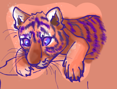
not a character, i've decided i don't vibe with the oc-connection-and-collection culture so i just draw what i want and then drop it ✌️
lil mans was gonna do them looking at a cricket but decided nah when sketchpad almost erased all my lines >:C
- the reference doesn't have the cub's back legs visible so he is potato from the shoulder down
still struggling with what colors really pop together and how to not bring them down with lighting/shadows. should there be more yellow maybe? i used all shades of the same color for the shading. should have used something besides purple for the lines? |
|
|
| |

Neutral
|
i feel like there should be more blue in it than purple. maybe lines dark blue and stripes purple? maybe make the rocks blue? |
|
|


