| |

Neutral
|
That's so insightful and helpful, Iruna! :0 I'm glad you're one of those who love sharing tips, it is annoying when people are secretive about that. I most definitely will try that sometime. :> - Do you possibly have a screenshot of your layers? I'd like to see how you draw and I'm more of a visual person aha :> |
|
|
| |

Neutral
|
Iruna said:
:) I love sharing tips. I always hated people who coveted their processes like it's a trade secret. One of my favorite tricks is duplicating the lineart layers and setting both layers to overlay, that way you have the lines different colors depending on the colors beneath it . All my lines are double overlay with the exception of facial features (eyes, eyebrows, mouth, and nose) Ooh--I've never considered there are people who genuinely hide their processes, so I suppose I've been in all the right communities! And the double overlay, that's genius! :0 I gotta use that sometime! - I can definitely see how it works, especially in relation to the lights and shadows depicted in Luke Avi's piece. Man, I love that. Thank you for sharing. <3 - I don't have a lot of art tips since I take a direct approach, push and pull. But, last I played with effects, I discovered the dither-noise effect on Krita that I liked. You'll make a "Palettize" filter mask over the piece, set the Palette to whatever you'd like, maybe even to a gradient, select the Dither box, and Threshold Node to Noise, then you'll set the rest of the factors to whatever you'd like to get a desired amount of dithering. |
|
|
| |

Neutral
|
Le Stalk said:
That's so insightful and helpful, Iruna! :0 I'm glad you're one of those who love sharing tips, it is annoying when people are secretive about that. I most definitely will try that sometime. :> - Do you possibly have a screenshot of your layers? I'd like to see how you draw and I'm more of a visual person aha :>
I can send you a layered version of an image of your choice, just tell me which you want. If I still have the layered version I can send you it. I'm not sure if it'll be much help though since my colors are done by colorpicking / brush interactions
Yuketa said:
Iruna said:
:) I love sharing tips. I always hated people who coveted their processes like it's a trade secret. One of my favorite tricks is duplicating the lineart layers and setting both layers to overlay, that way you have the lines different colors depending on the colors beneath it . All my lines are double overlay with the exception of facial features (eyes, eyebrows, mouth, and nose) Ooh--I've never considered there are people who genuinely hide their processes, so I suppose I've been in all the right communities! And the double overlay, that's genius! :0 I gotta use that sometime! - I can definitely see how it works, especially in relation to the lights and shadows depicted in Luke Avi's piece. Man, I love that. Thank you for sharing. <3 - I don't have a lot of art tips since I take a direct approach, push and pull. But, last I played with effects, I discovered the dither-noise effect on Krita that I liked. You'll make a "Palettize" filter mask over the piece, set the Palette to whatever you'd like, maybe even to a gradient, select the Dither box, and Threshold Node to Noise, then you'll set the rest of the factors to whatever you'd like to get a desired amount of dithering.
I've never tried many filters, maybe a watercolor paper filter or just sharpening the image. I'll have to check it out. I actually had to google what Dither is haha |
|
|
| |

Neutral
|

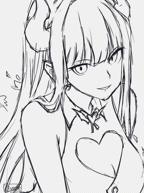
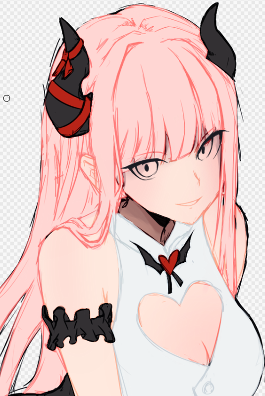
Another WIP for (you guessed it) a vtuber. I'm not sure how I tapped into this community, but honestly no complaints here. |
|
|
| |

Neutral
|
|
| |

Neutral
|
Edited at July 7, 2023 09:47 PM by Iruna
|
|
|
| |

Neutral
|
|
| |

Neutral
|
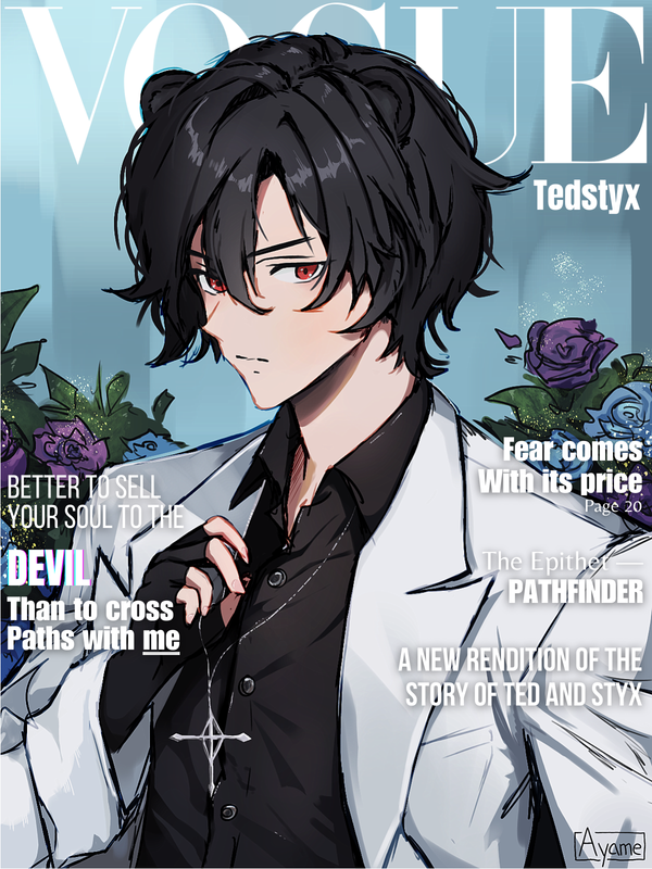
Finished, after this I'm 100% reimplementing my "3 edits max" rule |
|
|
| |

Neutral
|
aahhh it's been a while sorry - Oh alright, it's fine then if it's not worth your trouble aha. Thanks for sharing though! - lmao, at least you're getting business! I love the flowers and the glittery effect on them! Along with the cool necklace and how it's held. Gives off a very regal but intimidating vibe. these captions, man- very nice! - You made the pinks and light colors all work together while still making the features identifiable! Amazing job. Oh yeah I saw your chat post about having to edit it 15 times- god, so sorry about that. D: that sounds so painful. i try not to edit my pieces as much after because the more I look at it the more I find wrong with it, and then I end up eventually ruining it aha. |
|
|
| |

Neutral
|
Iruna - Yeah, dither is certainly a thing--I had to google it too and even now I'm not sure I could give it a proper explanation. XD - Oooh Tedstyx has such a cool vibe! The light in his page shines. As always, I appreciate seeing all the stages of this last piece! The light perspective work in the angle above the character was done so well! |
|
|


