| |

Lightbringer
|
Sketchy Ninja Hush now- Your art is beautiful, little mistakes and all. Mistakes are what make it look better, in fact ;) That avatar ahhhhh :O Loveeeeee love LOVE Maybe change the type though? I didn't notice it for a few seconds because it blended in lol |
|
|
| |

Lightbringer
|
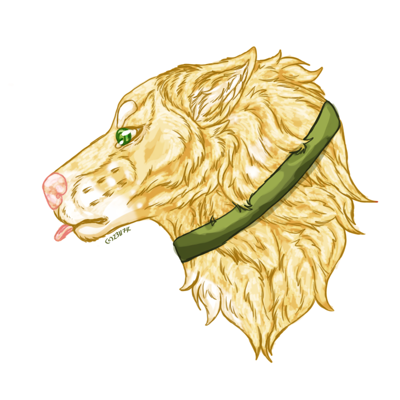
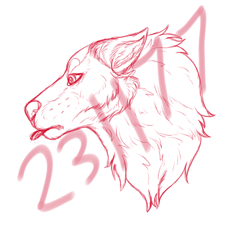
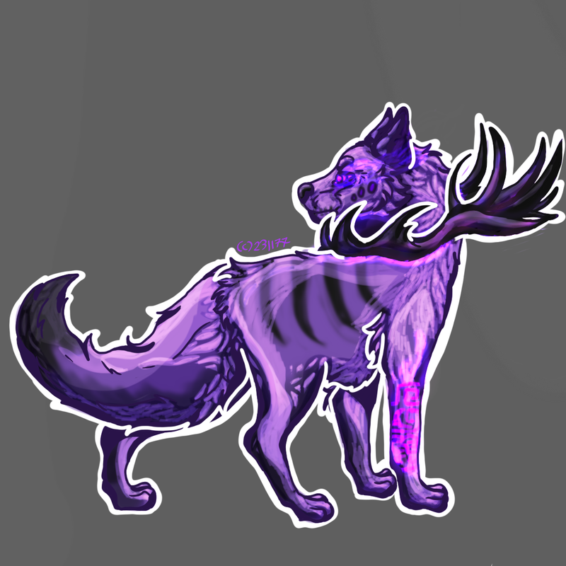
The sketch - Kinda liked it qwq Last Blep YCH for Chu ~ |
|
|
| |

Lightbringer
|
Bitsy, lmao, we do love mistakes :') That's a good point - my text usually either blends in or stands out way too much haha |
|
|
| |

Lightbringer
|
Sketchy Ninja Lol yep Oof XD Just keep experimenting! And I love the new art :O |
|
|
| |

Lightbringer
|
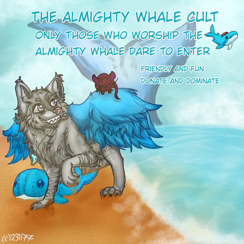
The sand looks off to me compared to everything else, it looks quite smooth rather than the water which has a lot of details. But I'm probably just looking to close. qwq
Hallbjorns said:
A thing for Miss Wolf's alliance avatar contest I'll probably make edits to it because - some stuff doesn't look right to me. I'd appreciate any criticism lmao
|
|
|
| |

Darkseeker
|
I must ask how you do the lines? .o. |
|  |
|
| |

Lightbringer
|
Tween Artor, w - what lines - Do you just mean lining in general? :0 Spark Le Great, nah, you're completely right :') I don't know how to do water. But I'm even less confident with sand haha. It definitely lacks a lot of texture ;; Bitsy, yes - experimenting all the way *^* |
|
|
| |

Darkseeker
|
|
| |

Lightbringer
|
|
| |

Lightbringer
|
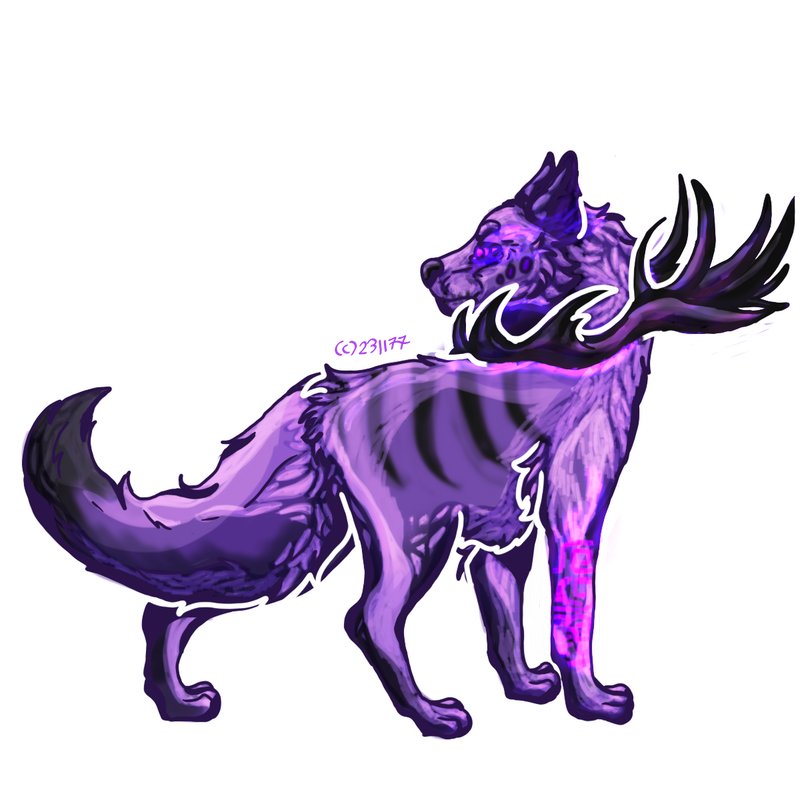
Finished cartoon fullbody for Clock ~ still developing and playing with the shading ^^ A BG to show the white outlining |
|
|


