| |

Neutral
|
I love all your Art! It's amazing <3 |
|
|
| |

Lightbringer
|
Crescent Nightwalker said:
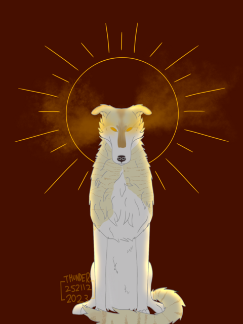
So beautiful I'd just call it "Halo" 😊 Darcy :3 said:
I love your art! It's adorable and pretty and your really talented <3 WitchWolf said:
Wow! Amazing art <3 thank you all<3 |
|
|
| |

Lightbringer
|
Catie said:
I love all your Art! It's amazing <3
thank you<3 |
|
|
| |

Darkseeker
|
Love the art! :D If you're looking for criticism, I would mention shading - it plays a huge part in artworks feeling "whole", so just messing around with different layer settings is a good start :3 For example, in simple terms: Add-layers for light and Multiply-layers for shadows c: it'll make the process pretty painless! |
|  |
|
| |

Lightbringer
|
Polargeist said:
Love the art! :D If you're looking for criticism, I would mention shading - it plays a huge part in artworks feeling "whole", so just messing around with different layer settings is a good start :3 For example, in simple terms: Add-layers for light and Multiply-layers for shadows c: it'll make the process pretty painless!
thank you! i struggle with shading for some reason so that's helpful :> |
|
|
| |

Darkseeker
|
Oh man, I used to struggle with it too :D but really, experimenting takes you a long way! Also testing all the other layer options and seeing what they do is very helpful As a loose principle I often shade with a light grey-blue on Multiply and whichever colour the light should be on Add :3 (Of course this depends on scene and lighting) |
|  |
|
| |

Lightbringer
|
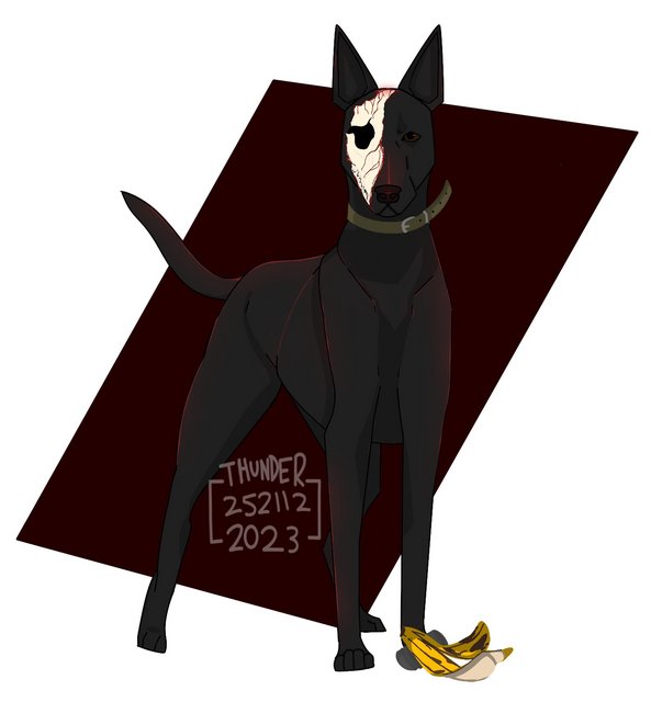
actually finished this one not sure if i like it or not but yknow at least Tyche gets more art :> and then Emrys <333 this was supposed to be done by halloween but i only finished it yesterday and then the blood version (wasn't sure if this was allowed or not xd) i promise it looks better when it's not resized thanks Polargeist for giving me tips on shading :> |
|
|
| |

Lightbringer
|
i actually don't know what happened that made my art better but i'm not complaining |
|
|
| |

Lightbringer
|
reminds me of a glow stick |
|
|
| |

Writer
Darkseeker
|
Youve made a lot of improvements. Id continue to keep an eye on proportions. For example, the muzzle on your recent piece ia a bit long and large for its face/neck proportions. Keep working on the shading and light. Keep in mind about where your light source is coming from: for example, if the sun is directly above, the light would be more direct on the top of the wolf, and not direct at all on the bottom of the wolf. |
|
|


