| |

Neutral
|
Aw heck yes I love the smoothness of your lineart and your coloring! the pose looks very dynamic. my one suggestion is just to fix the legs a little maybe? unless you were going for that effect, it looks a little floppy and the front legs are a little awkward to me. You could bend the back legs and make the joints a little bit clearer, and maybe bend the front legs a bit as well? ^^ - Here's a design I made on a base I made as well. :> (c) #290311 |
|
|
| |

Lightbringer
|
The colors go really well together. One thing that could improve it is the shape. the body looks skinny and the head could be rounder. ------- This might end up being a profile picture sometime. |
|
|
| |

Darkseeker
|
It's very round and cute <3 maybe add some fluff? And the eye could use some experimental edits, otherwise it's super simple and cute :D 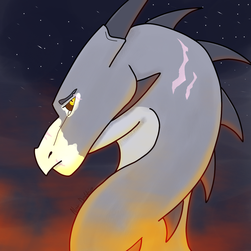 Credits to me :) |
|
|
| |

Lightbringer
|
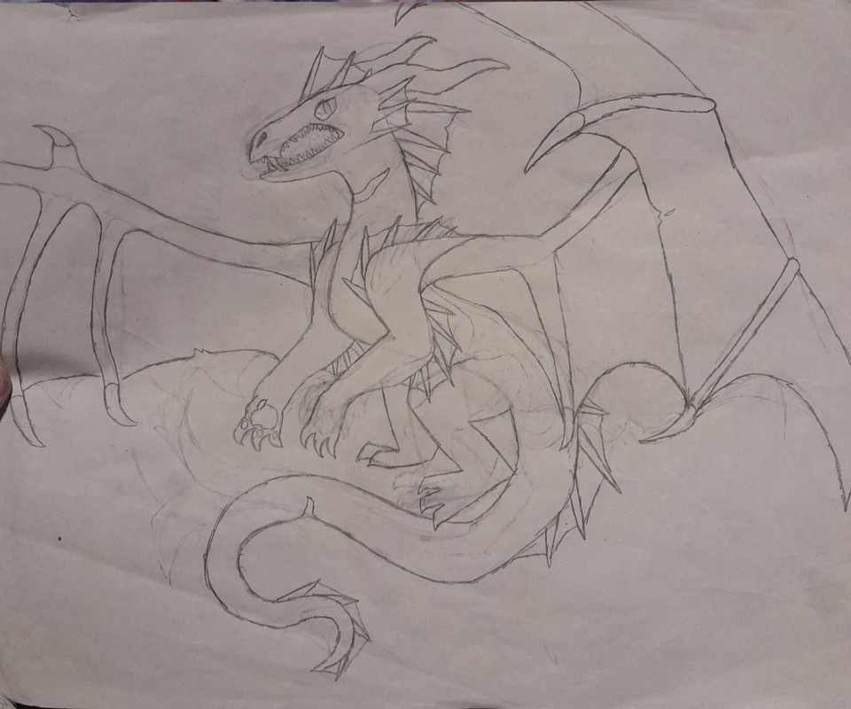
I adore the glow (fire?) there, and how it looks in the night sky. The lines are smooth and the pose conveys positioning very well, the expression is great too! I would maybe put a little more contrast between the glow and the dragon? Like more shadowed areas to get the feeling of nighttime broken by the glow of a fire. Otherwise it's great. ~ Credits to me: Traditional media dragon sketch~ 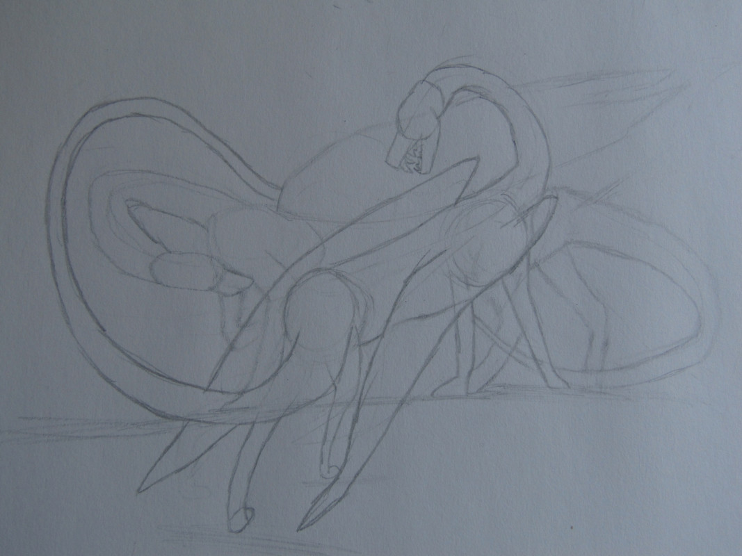 |
|
|
| |

Neutral
|
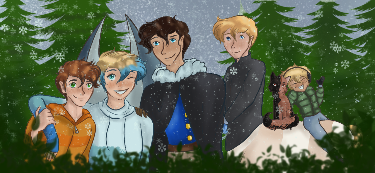
I love that you added multiple characters, and the poses? Perfection! Dude I love it- The guy in the backs neck is a bit wonky, and the front guys closest back leg could be a tad bigger. ----- Credits; Sketched / me |
|
|
| |

Lightbringer
|
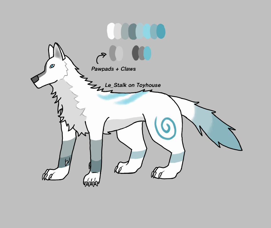
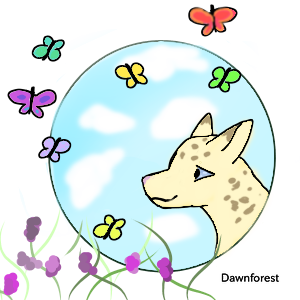
I love how soft the face looks, absolutely adorable! I think the only thing that I can say is just the paws. Paws are hard, but when it's more feline, their paws are just a little rounded. ---- tried something new/old? Idk. Tried something. (C)85543 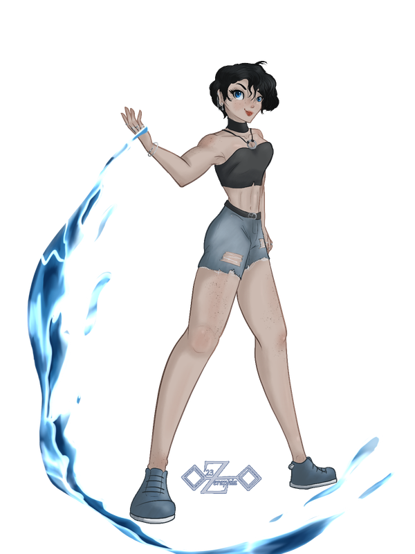
Link - better quality |
|  |
|
| |

Darkseeker
|
I love that *^* The anatomy is awesome and the water affects?! Wow, just WOW!! I can't really offer much of a tip because I don't draw humans often, but the eyes seem just a *little* off kilter? - 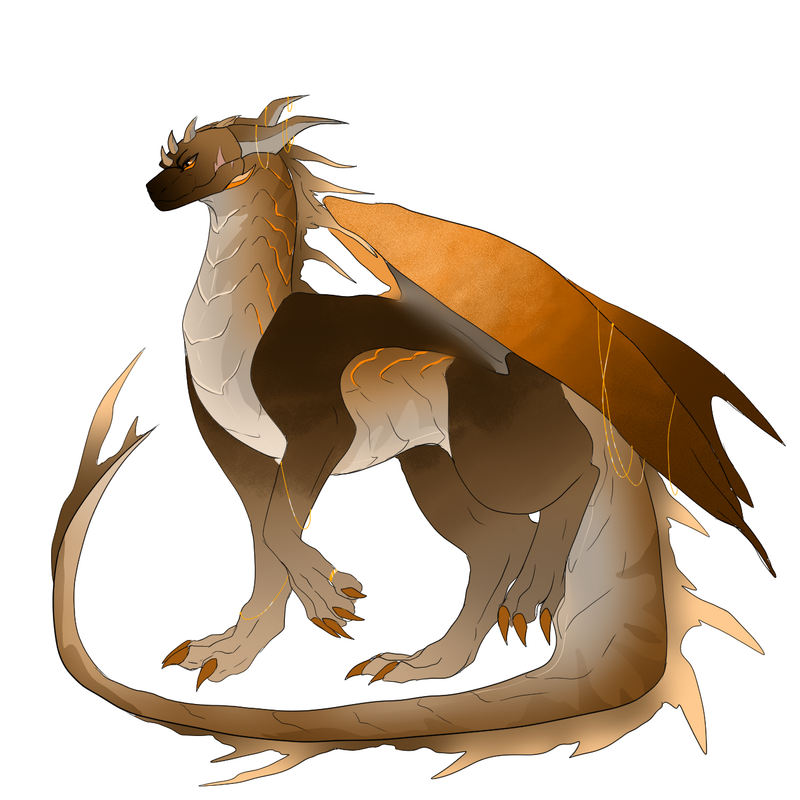 An adopt I just completed ^ |
|
|
| |

Forum Moderator
Darkseeker
|
Oh man! I absolutely adore the posing and subtle texturing on the gradients. Your lines are super confident and the overall design is super cohesive - there's nice variation in the colours and shades. The orange accents really pull everything together. Anatomywise, I think the head might be a little small and the wings look like they're jointed from the back rather than the shoulder [though, that might be an intentional species trait, I'm not sure]. There's also juuust a few little gaps in the colouring, especially on the feet and wings. Having those filled in would definitely improve the overall finish of the art piece! :0 Either way, it's stunning and I adore the gold attire *^* - [c]157083  |
|  |
|
| |

Lightbringer
|
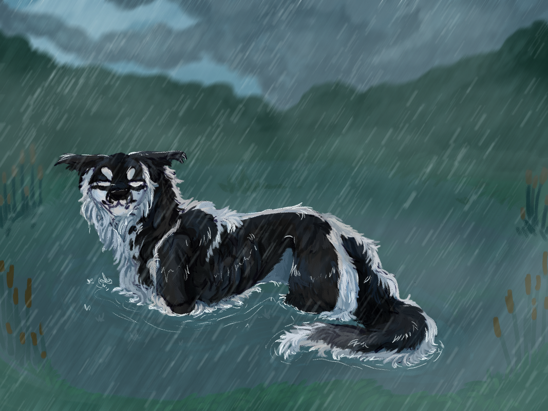
Mmh, just perfection. The mood of the piece is really emphasized by the expression and lighting alone. The soft background highlights the character so well. I think the only thing I'd have to say is maybe just giving the fur just a bit more of a wet-feel, droopy and just b
l
e
h sort of feel to it? If that makes any sense whatsoever, I'm sorry. XD ---------- 
Kind of long but it could be bigger if I had everything else in it. XD (c)85543 |
|  |
|
| |

Neutral
|
I love the cute little kitty and little kid so cute! They look very nice and even, the cloths are really good. Could maybe work on making them look different? They have all different features obviously but their faces all look the same to me. |
|
|






 An adopt I just completed ^