| |

Neutral
|
Lans Give it a go anyway ^^ I mean, my redlining for your art was so helpful. |
|
|
| |

Neutral
|
|
| |

Darkseeker
|
Could I just slide in here?- I've got something I finished, but I feel like the eyes/face just don't match up right. Could any of you help with that? |
|
|
| |

Neutral
|
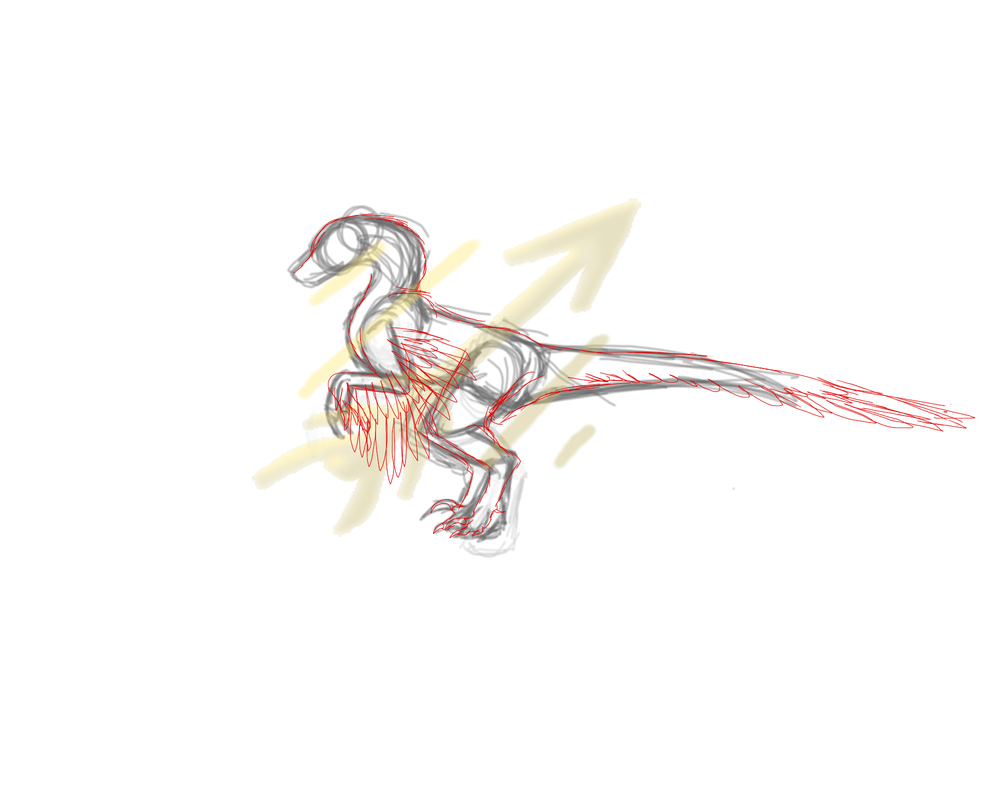
Here ya go. I don't know if I was redlining it or just adding touches to the sketch lol. Again, probably not the best help in the world, and I suggest ignoring this piece of crap: |
|
|
| |

Neutral
|
Lans Looks good! It's the little anatomy tweaks that are gonna be mega helpful. |
|
|
| |

Neutral
|
On a scale of one to ten, how edgy is my new avatar? |
|
|
| |

Neutral
|
4/10 I liked the old one to be honest |
|
|
| |

Neutral
|
Same.
But I hated how soft it looked, so I tried making it edgier. But I know nothing of the phrase "All things in moderation," so look where we are now.
|
|
|
| |

Darkseeker
|
I liked the old one as well.
Lansnow said:
4/10 I liked the old one to be honest
5/10 Compared to your old one. I do like the colors! But I feel like its lacking details
ASomeonePerson said:
On a scale of one to ten, how edgy is my new avatar?
|
|
|
| |

Neutral
|
Dragonhorse said:
I liked the old one as well. 5/10 Compared to your old one. I do like the colors! But I feel like its lacking details
I agree. I'm planning on adding more once autodesk gives me my damn brushes back. |
|
|


